✌️ Welcome to the latest issue of The Informationist, the newsletter that makes you smarter in just a few minutes each week.
🙌 The Informationist takes one current event or complicated concept and simplifies it for you in bullet points and easy to understand text.
🫶 If this email was forwarded to you, then you have awesome friends, click below to join!
👉 And you can always check out the archives to read more of The Informationist.
Today’s Bullets:
Feeling Neutral
Seeing (R) Stars
What Does the Market Know?
Protect Thyself
Inspirational Tweet:
With the Fed now in Rate Cut Mode and markets fluctuating around both expectations and economic data—along with significant geo-political and election uncertainties—everyone and their brother is trying to figure out how fast the Fed will cut and where they will ultimately stop.
AKA, the neutral rate.
But why does it really matter, and more importantly, how will it affect you and your portfolio?
If any of this sounds confusing, Don’t worry. Because we are going to sort out the neutral rate and more for you, nice and easy as always, here today.
So, grab your favorite mug of coffee and settle into a nice comfortable seat for a simple interest rate discussion with this Sunday’s Informationist.
😐 Feeling Neutral
So, what is the Fed’s target for this cycle, where will they stop?
Well, we’ve heard Chair Powell say it more than once, he is looking for that elusive neutral rate. In the press conference after the latest Fed Policy Meeting in September, Powell said:
“…we’re recalibrating policy down over time to a more neutral level. And we’re moving at the pace that we think is appropriate given developments in the economy and the base case.”
He then continued:
“…you know, it feels—it feels to me that the neutral rate is probably significantly higher … How high is it? I don’t—I just don’t think we know.”
Let’s unpack this carefully.
First, the neutral rate—often called R-neutral (not to be confused with R* (Star), we will cover that in a moment)—is the theoretical interest rate at which an economy is in equilibrium.
This means, it is the rate where monetary policy is neither stimulating nor restricting economic activity.
This would mean that both of the Fed’s mandates are being fulfilled:
Full employment, where nearly everyone who wants a job has one
and Stable pricing, where inflation is contained at 2% annualized
In other words, the neutral rate is the "sweet spot" for interest rates.
High enough to prevent overheating (excessive inflation or speculative bubbles), but not so high that it causes recessionary pressures (slowing growth, rising unemployment).
Thing is, the neutral rate is purely theoretical. It can’t really be measured, it is just observed through economic health and activity.
And so, this is why Powell says things like: “it feels to me” and “I just don’t think we know.”
Instead, he refers to rates being accommodative, restrictive, or neutral as an overall gauge of their stance.
If Fed Funds is above the estimated neutral rate, then the Fed is being restrictive.
If the Fed Funds is below the neutral rate, the Fed is being accommodative.
And once all the dust settles from a cycle overheating and rate hikes, like this past few years, and the Fed sees the rates as being overly restrictive, it begins the lower them.
It started with a .5% rate cut last month.
The fEd will keep cutting until it gets to that neutral rate nirvana, where The Fed gets to play Goldilocks with its Little Wee Bear porridge. Not too hot, not too cold, but rather just right.
But let’s face it, this is the Fed, and they can’t just hold a finger up to the wind to see if it ‘feels’ right.
No, we need data. Cold, hard, actionable data.
And so this is where R*(Star) comes into play.
🤩 Seeing R Stars
Because the Fed and economists love 🫶 economic models, as flawed as they are, they of course have a model that focuses on calculating the estimated Real Neutral Rate or R*.
Before we get confused, and to keep you armed with information when you read about all this in the news, let’s clarify a couple of things.
The neutral rate that we talked about above would be considered R-Neutral.
Because it’s a nominal rate, it includes the effects of inflation.
That’s right, the Fed wants (read: the Treasury needs) inflation, remember? And so the neutral rate allows for that inflation and does not include it in its estimation.
R* (R-star) on the other hand, is referred to as the real neutral rate. And unlike the nominal neutral rate, R* is adjusted for inflation, making it a real rate of return.
In other words:
R-neutral (Neutral Rate) = R* + Expected Inflation
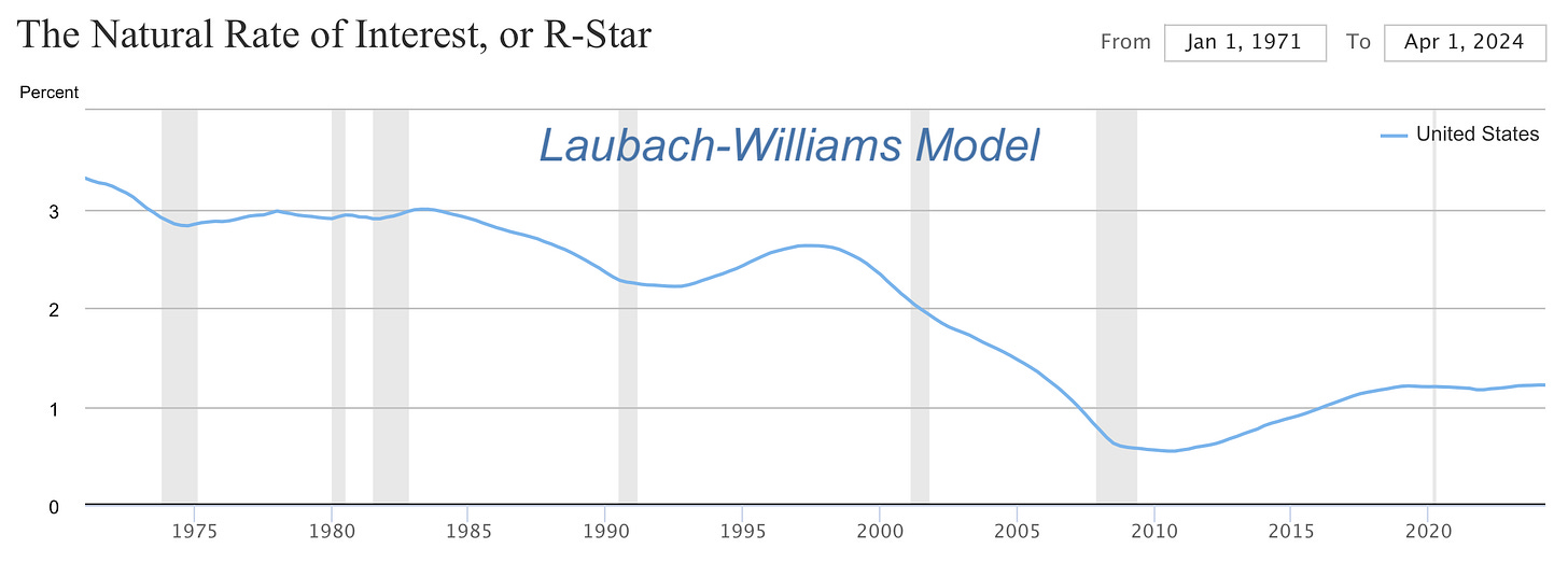
And this is where the handy Laubach and Williams (LW) and Holston, Laubach, and Williams (HLW) models come into play.
We won’t get into how they’re calculated here, but both models estimate R* by analyzing relationships between key economic variables like economic output, inflation, and interest rates.
They kick out estimates, like this:
And though they overall look similar, the HLW model is supposedly more accurate due to upgraded calibration vs the LW model.
In truth, though, the R* is so purely academic and theoretical, and so it’s almost useless to us as investors—but you will likely hear economists and Wall Street analysts wax poetic on them, soon. 🤓
Much more important, to us though, are the actual Fed estimates and the markets themselves.
🧐 What Does the Market Know?
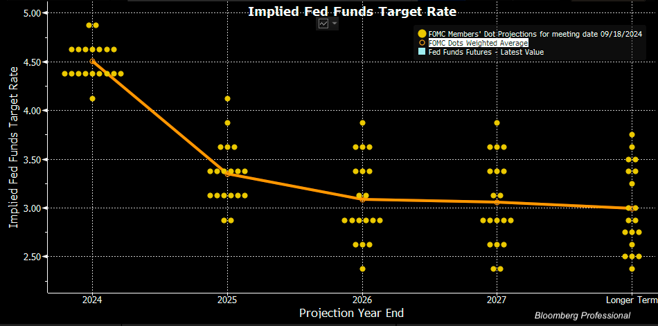
Another piece of information we got from the latest Fed Rate Policy meeting was the all-too-interesting Fed Dot Plot.
You know, the chart showing a dot for each Fed official and where they believe interest rates are headed near and long-term.
This one:
The orange line shows the weighted average of the dots and we can see where the Fed believes rates are going overall.
See that last label, “Longer-Term”?
This is the best indication we have of where the Fed thinks the neutral rate is, where they believe the rates should stop and be held without being restrictive or accommodative.
The “steady state” of rates.
Looking at the Dot Plot chart, it appears the Fed believes that the longer term estimate for rates is about 3%.
If we chart the history of this Longer Term set of rates (past Dot Plots), we can see how the estimated neutral rate has changed in the last ten or twelve years.
After hanging up in the 3% to 4% range from 2012 to 2016, then bottoming at the 2.5% level during the Covid lockdown years, the expected neutral rate appears to have percolated back up to the 3% level again.
What does Wall Street think, though?
Looking at the Fed Funds Futures, we can see that investors believe Fed Funds rate will bottom out at about 3.25% this cycle, before beginning to tick higher again.
Pretty close.
Another market-driven indication of longer-term rates can be found in the 10-year US Treasury.
Considered the benchmark bond for global finance, the 10-year can give us clues where investors and traders believe rates will gravitate to in the future.
Looking at the US Treasury curve today, it appears the market believes that rates will go to just under 4%, long-term.
An important note here, though.
This reading was this morning, after a surprisingly strong employment report on Friday. One that was not factored into the Fed Dot Plot.
That said, the Fed Futures reading was after the employment report, too. So, why the discrepancy between the Fed Futures (~3.25%) and the 10-year UST (~4%)?
Looking at historical 10-year yields versus the Fed Funds Longer-Term projections, they often differ.
Why?
A few reasons.
When the 10-year Treasury yield is substantially below the FOMC’s longer-term projections, it implies that the market expects either slower economic growth, lower inflation, or that the economy might need more accommodative monetary policy over the longer term.
I.e., the 10-year anticipates the Fed lowering rates soon.
You can see in 2012 to 2014, the 10-year was lower than Fed projections, which eventually caught up.
But now the 10-year yield is substantially higher than the Fed projections.
This signals that the market is pricing in either higher growth, higher inflation, or risk premiums.
Does this mean the bond vigilantes are back?
If you have not read about the bond vigilantes or want a quick refresher, I wrote a whole newsletter about them that you can find here:
TL;DR: Bond investors may be worried that because the US government is running such large deficits, they will have no choice but to eventually flood the market with longer-duration bonds, and buyers of those bonds will demand a higher yield on them.
Why?
Because of an almost certainty of higher future inflation means that the real return (yield minus inflation rate) will be negative if the yield is not high enough.
In short, they demand what is called a ‘risk premium’, or additional yield over the so-called neutral rate.
And with the robust employment report, at the same time that the Fed has already begun cutting rates, and the report that the US Treasury borrowed an astounding $382 billion in just the last five days likely has longer-term bond buyers on edge.
Or at least on notice.
Great. What does this all mean to us as investors?
🫣 Protect Thyself
We are going to keep this super simple and focus on first principles.
The undeniable fact is that the US government, and hence the US Treasury, has a structural problem.
This problem is overspending.
The overspending is causing massive deficits.
The massive deficits are causing massive borrowing.
The massive borrowing is piling own top of past borrowing, and the debt load is growing almost exponentially.
This problem cannot simply be solved with cutting expenses, because the government has already piled up over $175 trillion of unpaid liabilities in the form of Social Security, Medicare, and Medicaid.
This problem is not going to disappear. It is only getting worse.
Let me be clear and speak loudly for those in the back: I am not being alarmist here, as this can continue for many years, in my personal opinion.
However, the key component to the continuation of this spending charade requires inflation. In particular, the inflation of the money supply.
And this will, in turn, cause asset inflation again, as well as goods inflation—if we see more direct stimulus for some reason(s).
This can come in the form of long-term perpetual, structural inflation of say, 3 to 5%, or it can come in the form of a spike of inflation that holds for a few years at up over 15 to 20%, like we saw in the 1980s.
The risk here, as an investor, is not being exposed to the asset classes that can help mitigate this inflation pain.
Assets that I have spoken about at length before, like gold, silver, and Bitcoin.
A simple normalized log chart of Bitcoin and the global money supply shows how—though volatile in the short-term—Bitcoin is extremely correlated to the global money supply in the long-term.
And as the US expands its own money supply, the rest of the world will have little choice but to do the very same.
That’s it. I hope you feel a little bit smarter knowing about the neutral rate, how the Fed looks at and calculates it, and what it could mean for your investments.
If you enjoyed this free version of The Informationist and found it helpful, please share it with someone who you think will love it, too!
Talk soon,
James✌️


So, R* is something like the perfect thermostat setting for the office?