

📶 Welcome to The Informationist. Each week I take you inside the decisions that move markets and make sense of the forces at work, in a few minutes.
✅ One topic, exposed and explained, so you can make sharper decisions with your own money.
➡️ If this was forwarded to you, you have good taste in friends. Join 45,000+ readers here.
Today’s Bullets:
The Case for Panic
Why the Scary Chart Mostly Measures Price
What’s Actually at a Record
The Dynamite, Not the Spark
How to Read It
Inspirational Tweet:
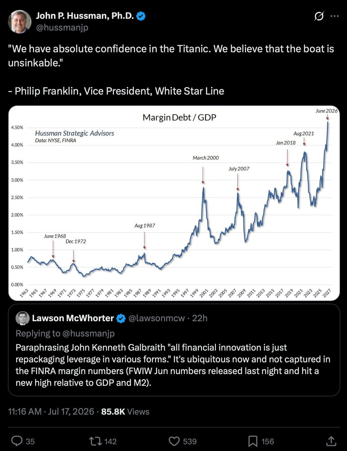
Well, well, well, the world lives on debt, and by extension, the stock market is no stranger to the dangerous jet fuel.
As such, the above chart has been making the rounds these last few weeks.
Showing margin debt measured against the size of the economy, with a red arrow on every major top of the last sixty years, it looks to be launching like a rocket in 2026.
Hence Hussman’s comparison of the situation to the hubris of a VP of White Star Line, the owner and operator of the ill-fated Titanic.
“Unsinkable.”
On one side, the raw facts behind the argument of doom are concerning, as we will get into in a moment.
But there is plenty more to this debt story and the history behind the rise in margin debt being associated with market tops and crashes.
So which is it?
Does record margin debt mean a crash is coming? If it does not tell you that, what does it tell you? And is there another number inside these same figures, one that genuinely is at an extreme, that has earned more of your attention than the one filling your feed?
All good questions, and important ones. And ones we are going to answer, nice and easy as always, right here today.
Fair warning, this is a longer one than usual. It's the kind of institutional-grade breakdown that normally lives on a research desk, just written plainly enough that none of us needs a Bloomberg terminal to follow along. Let’s get at it.
So pour yourself a big cup of coffee, and settle into your favorite seat, for an honest read on what today’s record margin debt is really telling us, with this Sunday’s Informationist.
Partner spot

You’ve spent years thinking about what happens to the dollar. Have you spent any time on what happens to your bitcoin after you are gone?
Most bitcoin holders think they have an inheritance plan, but they don’t.
Knowing where your keys are isn’t a plan. Neither is telling your spouse the seed phrase. And the will your attorney drafted years ago might not account for any of it. Bitcoin inheritance isn’t just a technical problem, but a legal one too. Your heirs need both the keys and the legal authority to actually use them.
There’s a quick way to find out how exposed you actually are. Get your free bitcoin inheritance readiness score in under 2 minutes.
The Case for Panic
Back in 1998, I was trading arbitrage at a hedge fund, the same corner of the market where Long-Term Capital Management lived. So I had a front-row seat when it came apart.
A firm run by actual Nobel Prize winners, the finest models on the Street, levered to the eyeballs. It worked beautifully, right up until it didn’t. When the trades turned south, the borrowed money didn’t just sit idle, waiting for a recovery.
Losses fed on the leverage, the margin calls went out, and the whole thing unwound so fast it nearly dragged a large part of the global financial system down with it.
I wrote a whole issue about hedge fund leverage recently, and it covers LTCM in more detail. If you want the full story, it’s right here:

I bring it up because I know, firsthand, what borrowed money does to a market when it turns. And it’s why margin leverage charts seem to be popping up all over my feed lately (and likely yours).
First, a word about margin, nice and easy for those of you who don’t stare at this stuff all day.
Buy stocks with your own cash, and when the market drops, you’re annoyed at best, frustrated at worst. If nothing is changed and your conviction remains, you either add to your positions or you wait. Eventually it comes back or it doesn’t, but either way, the call to sell is yours to make.
Buy those same stocks with borrowed money, and you’ve handed a piece of that decision to somebody else. Your portfolio is the collateral on the loan, and when the market falls, that collateral shrinks while the loan stays exactly the same size. If it falls far enough, no human on the phone anymore, just an automated notice from a machine that has already decided.
Cold and clinical, it goes like this: Wire in more cash today, or we sell your stocks for you.
At the bottom. At the worst possible moment. You don’t get a vote.
That borrowed money is called margin debt. On the way up, it’s about the most fun you can have in a brokerage account, because leverage turns a good year into a great one. On the way down, however…you get the point.
So when I see margin debt going vertical, I pay pretty close attention. LTCM taught me why.
And right now? It’s been going vertical.
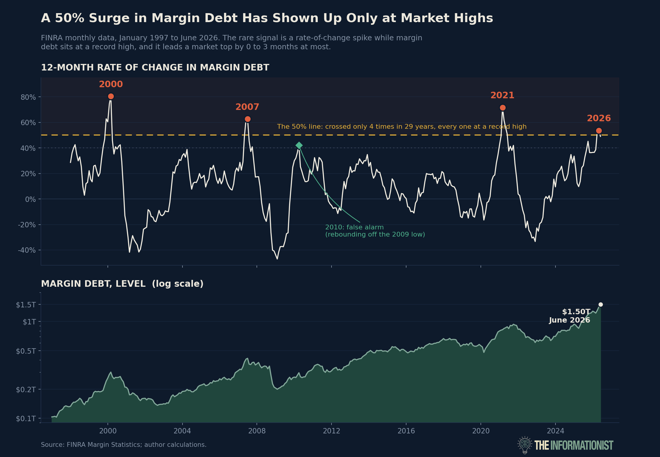
Margin debt just hit an all-time record. Just over $1.5 trillion of borrowed money riding on US stocks. It jumped 49% in the last year, and 23% in just the last three months. Stack it against the size of the whole economy, and it’s sitting near the highest level we’ve ever recorded, close to double what’s normal.
That number is worrisome enough on its own.
Now go back across the last two generations of markets. Each time this borrowing has spiked to an extreme against the size of the economy, a major top has been sitting right there beside it.
2000: The Dot-Com Bubble.
2007: Right on the doorstep of the Great Financial Crisis.
Late 2021: Right before the worst year for stocks since ‘08.
Every single time. Borrowing races to a record, the market rolls over, and all that leverage that drove prices up flips into forced selling on the way down. The same cascade I watched swallow LTCM, just spread across an entire market instead of one fund.
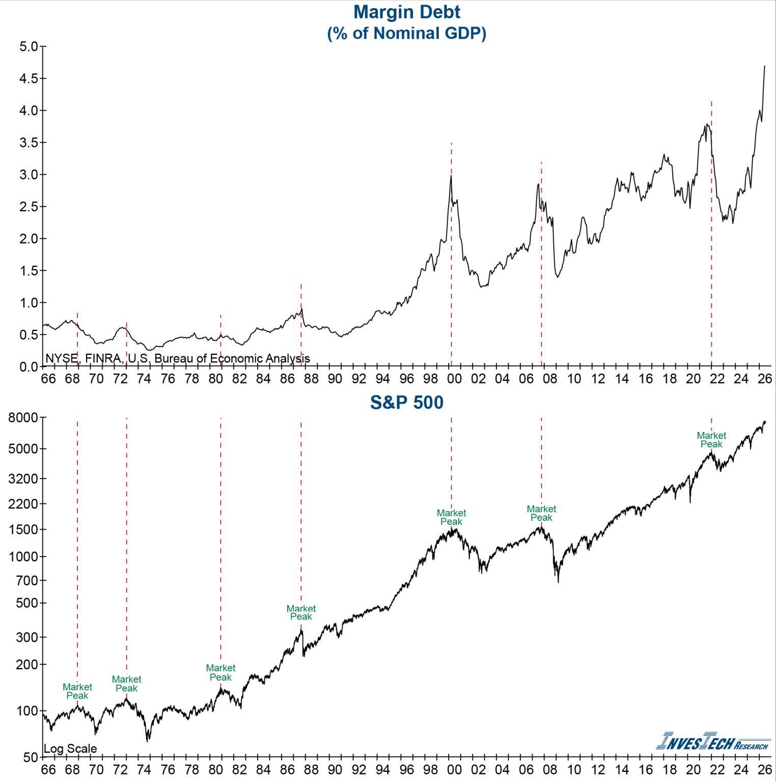
Compare those two lines stacked on each other.
As InvesTech Research shows with the dotted lines connecting them, each of the spikes in borrowing and the peaks in the market land on nearly the same dates.
The top chart here is similar to the one that John Hussman posted with that Titanic quote, the unsinkable ship. And you can see why it’s starting to hit investors’ nerves. We’ve run this experiment three times in my career, and it ended in a fair amount of blood every time.
So, yes, it’s unnerving and the bears aren’t wrong about any of it. The record is 100% real. The market truly has topped every other time we’ve been here.
So that settles it, right? Record leverage, matched only at the biggest tops in modern history, flashing red. Sell it all, go to cash, call it a day.
Not so fast, my friend.
Because in all my years of watching this, I’ve learned that a scary chart is only worth acting on after you’ve asked it a second question.
So we go back to first principles.
Before acting on the initial read and information, we must first ask: Is this market actually carrying more leverage than it did at those old tops? Or is that line rocketing higher for a reason that has almost nothing to do with danger, and everything to do with something a lot more ordinary?
When we get to that answer, this whole chart starts to look a whole lot different.
