💡The Great Inversion
Issue 132
✌️ Welcome to the latest issue of The Informationist, the newsletter that makes you smarter in just a few minutes each week.
🙌 The Informationist takes one current event or complicated concept and simplifies it for you in bullet points and easy to understand text.
🫶 If this email was forwarded to you, then you have awesome friends, click below to join!
👉 And you can always check out the archives to read more of The Informationist.
Today’s Bullets:
Yield Curve Basics
Inversions
Un-Inversion and Recessions
Un-Inversions and The Market
Inspirational Tweet:
With US Treasury yields super volatile and moving lower recently, the short end of the curve has dropped significantly more than the long end on a percentage basis.
And because of this, the curve that was inverted is now un-inverted (normal again).
Stay with me here. Because this has implications for both the economy and markets.
But what are these implications, and why should we care?
And if all this unintelligible bond talk has your head spinning, Don’t worry. Because we’re going to unpack each and every bit of this, nice and easy as always, here today.
So, grab a big cup of coffee and settle into a nice comfortable chair for a Sunday stroll down Bond street with The Informationist.
🤓 Yield Curve Basics
Before getting into the current situation, let’s quickly review the yield curve and what is normal and what is not.
For this of you have been reading my newsletters for a while, you may want to skip ahead to the next section. But for those who are new to the idea of a ‘yield curve’ or just want a refresher, read on.
First, a yield curve is simply a visual representation of all the yields of all the Treasures, plotted on a single chart. Like so:
You can see that the shorter durations of 1-month to 1-year (T-Bills) are to the left, the 2-year to 10-year (Notes) are in the middle, and the longer maturities of the 10-year to 30-year (Bonds) are to the far right .
In a normal environment, the yield ‘curve’ looks as it does above, with the shorter maturities yielding less and the longer maturities yielding more.
This makes sense, as investors will demand to be compensated for time (duration) risk the longer it takes for them to get their principle back.
That said, in (soon to be) troubled economies, the curve often inverts, where longer maturities yield less than shorter ones.
Why?
Because investors are concerned that financial conditions and the economy are likely to worsen. And so, they expect the yields to drop in the future, reflecting this falloff (and the expectations that the Fed will lower rates that they are keyed off of).
And the yield curve ends up looking something like this:
Here’s the thing about inversions: Virtually every US recession has been preceded by an inversion in the UST yield curve.
Remember: always watch the credit markets for clues of what is going on in the economy.
That said, inversions are less accurate in predicting the timing of a recession. Some occur a few months before and some happen years before any recession hits.
About that.
🤔 Inversions
If we look at the yield curve from just over a year ago, it looked like this:
Just glancing at the above plot, we see that it was severely inverted and super steep on the short end of the curve.
Classic inversion. And not good.
Bottom line, this means investors expect future yields to be far lower than current ones. I.e., for the Fed to lower rates in the future. And we all know that the Fed only lowers rates when the economy is stressed and conditions need to be loosened.
In an attempt to avoid or head off a recession. But the Fed is sometimes (read: almost always) too late to react. 🙄
In away case, when we look at the significance of the inversion, we are typically focused on the difference in the yields of the 2-year and the 10-year bonds.
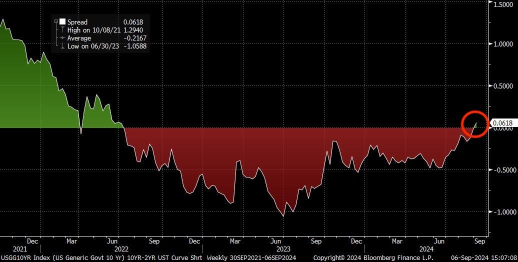
If we then subtract the yield of 2-year from 10-year, we see that the spread inverted way back in July of 2022 (red area below).
But economic indicators over the past few months and communications from the Fed have affected the yields and the curve has begun to un-invert.
And the yield curve now looks like this (green) vs one year ago (yellow):
The 2-yr yield has fall far more than the 10-yr, causing the un-inversion we see above.
By now you may be asking, Ok great, what does that mean for the economy? What does it mean for the markets?
Turns out it means a lot, and nothing. Let me explain.
🫣 Un-Inversion and Recessions
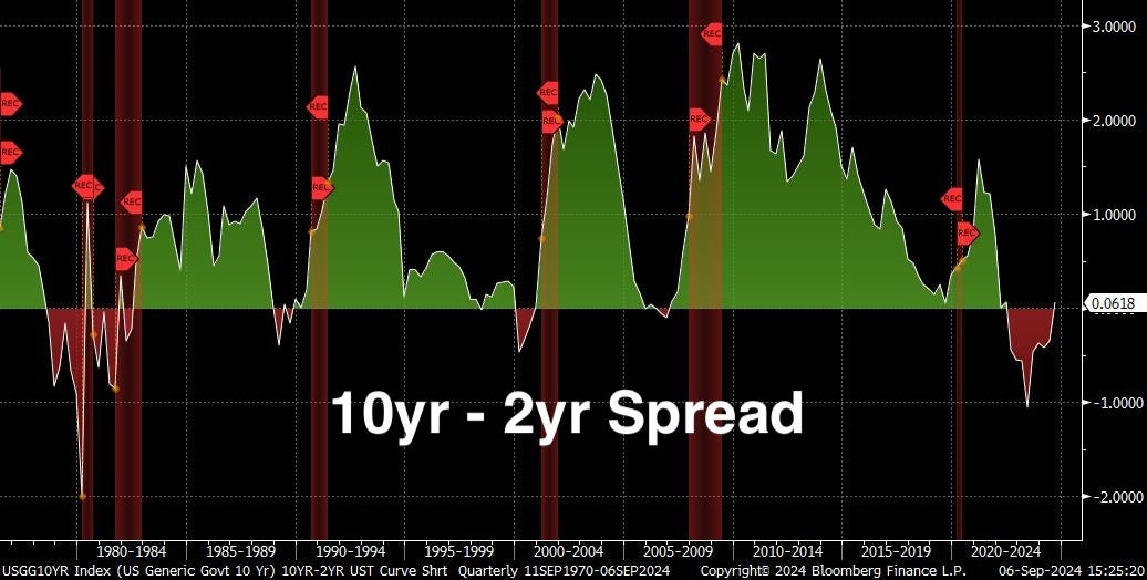
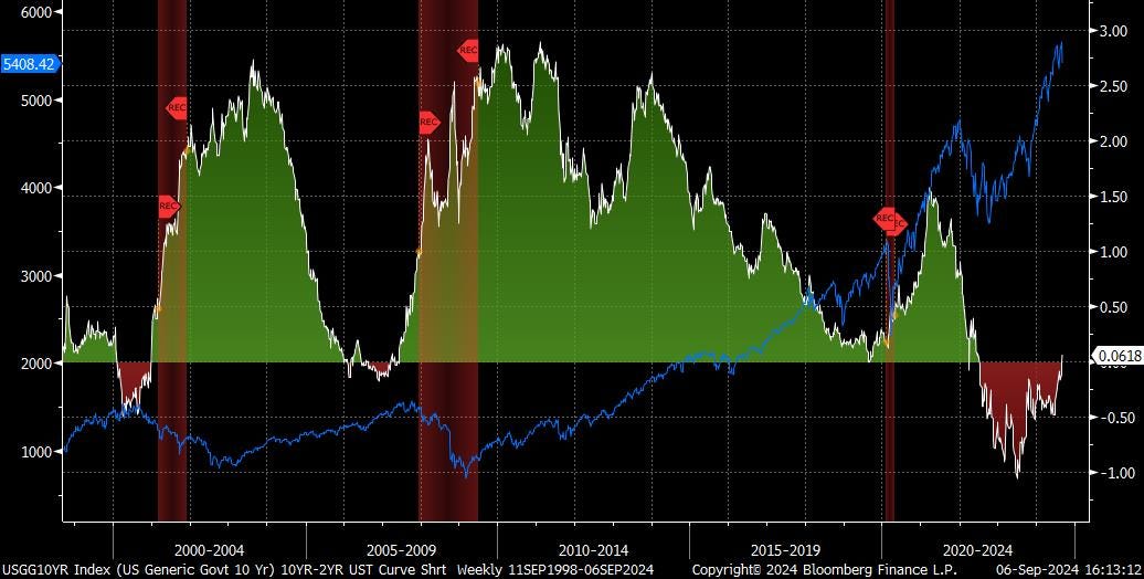
When we look at the 10yr-2yr spread, we notice a few things:
First, there’s a recession (red vertical bars below) after every single inversion. There is no arguing or debating this fact. We can see it clearly.
The second thing we notice is that the inversion, while a fantastic predictor of an eventual recession, is a terrible predictor of timing for a recession.
For instance, we saw an inversion back in August of 1978 but the recession did not hit until December of 1979, over a full year later. Flash forward to December 1988, where it inverted, and the recession did not begin until July of 1990. A year and a half later. And the inversion in 2006 un-inverteted and then re-inverted and then we didn’t hit recession until the end of 2007.
I mean, the inversions were all eventually correct, but the timing is all over the map.
And finally, the last thing we notice is that the depth of the inversion (how much lower the 10yr yield is than the 2yr) has pretty much no indication for how bad of a recession to expect.
Look at the teeny little of .18% inversion in 2007 and the financial hurricane of the Great Financial Crisis that eventually hammered the markets for years.
So even though this last inversion has been pretty deep at over 1% and it has lasted for over a year, we have no idea when and how bad any coming recession will be.
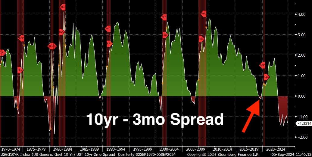
Before continuing, we should note that the 10yr-2yr spread is not the only one that investors look to for inversions.
One spread that’s arguably an even better recession indicator is the 10yr-3mo spread.
Look at how the 10yr-3mo even inverted back in 2019, somehow predicting the 2020 lockdown induced recession. 😮
In any case, once again, the 10yr-3mo is no better at predicting timing or severity of a recession than the 10yr-2yr.
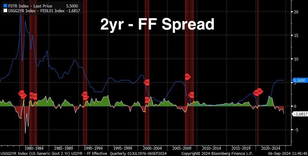
One last spread that I’ve been watching recently is the 2yr-Fed Funds spread.
Think of this more like a short-term indicator. For example, the last two times the spread reached over 1%, the Fed began reducing rates imminently.
I mean, it makes sense, as the market is basically telling the Fed that in two years it expects rates to be a full percent lower than where they are now.
Where is that spread now? -1.7%.
The largest spread on this pair since the early 1980s.😨
So, if history is an indication and this time is no different from the past six cycles, then we can expect a recession soon.
OK, but what about the market? What do the inversions tell us about them?
🧐 Un-Inversions and The Market
The reality is that yield curve inversions tell us little, if anything, about the direction of the overall market.
Let’s look at the 10yr-2yr spread.
In 1998, the market (blue line) began to sell off mid-inversion, well ahead of the actual recession. In 2007, the market began to roll over right as the spread un-inverted, but a number of months before the recession hit.
Much the same story with the 10yr-3mo spread, and there’s pretty much no pattern with the 2yr-FF spread.
That said, when we look at the Fed Funds rate and when the Fed pivots and begins to lower rates, this typically indicates imminent distress in the markets.
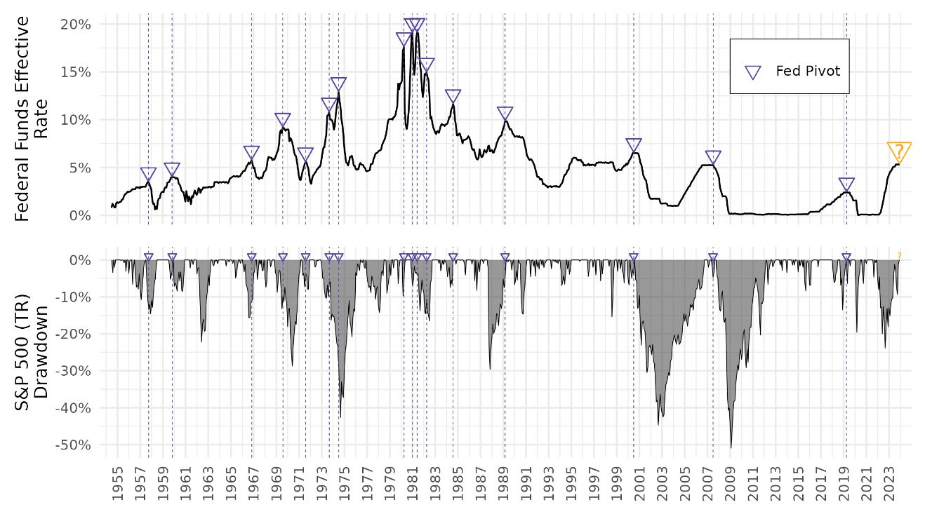
Look at this chart, originally posted by Michael Gayed (@leadlagreport on Twitter/X) a few months ago. The line on the top half is the Fed Funds rate, the triangles are the points where the Fed pivoted and began to lower rates, and the area charts on the bottom show the depth of each market drawdown (losses):
We can see in the vast majority (but not quite all) of the times that the Fed reversed course on rates (pivoted), the market had a significant drawdown of 20% to 50%. 😱
The one stretch of rates being lowered into a soft-ish landing was in the mid to late 1990s, where when the Fed lowered rates, we saw a single drawdown of 10%, some smaller ones, and then stable markets all the way to the Tech Bubble bursting in 2001.
So, the question on everyone’s mind today is: Can this happen again? Will the Fed lower rates and the markets escape the wrath of history? Like the 1990s?
As much as I would love to see this happen, the issue here is that we still have not experienced the recession that comes with every single yield curve inversion.
And there is pretty much no escaping the reality that if and when a recession does hit, the markets will react negatively.
How negative and how quick the Fed is to react to shore up liquidity and the markets is anyone’s guess.
And so, for me, I will remain well diversified and hold my pillars of high yielding cash, gold and Bitcoin to benefit from eventual substantial QE, as well as broad-based equities to remain exposed for the long-term upward trajectory of markets.
That’s it. I hope you feel a little bit smarter knowing about yield curves and what we can learn from them regarding the economy and the markets.
If you enjoyed this free version of The Informationist and found it helpful, please share it with someone who you think will love it, too!
Talk soon,
James✌️



It appears the Treasury has been forced to fund through T-bills verse longer duration (few are interested in long duration). If true wouldn’t that effect the yield curve differently this time? Thanks
But this time— Yellen has been messing around with the yield curve
From shortening duration issuance to stealth yield curve control by injecting liquidity
🤷🏻♀️🧐🧐🧐