
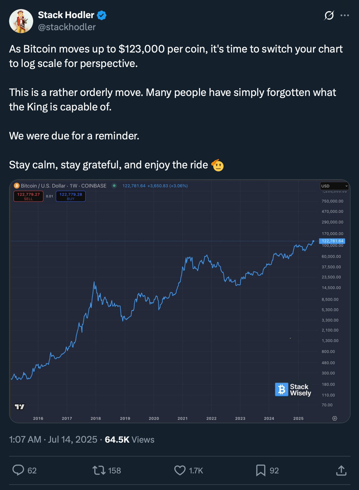
💡What is Log, Anyway?
Issue 176

✌️ Welcome to the latest issue of The Informationist, the newsletter that makes you smarter in just a few minutes each week.
🙌 The Informationist takes one current event or complicated concept and simplifies it for you in bullet points and easy to understand text.
🫶 If this email was forwarded to you, then you have awesome friends, click below to join!
👉 And you can always check out the archives to read more of The Informationist.
Today’s Bullets:
The Volatility of Adoption
The Noise of Volatility
The Log Solution
The Future of Bitcoin Price
Inspirational Tweet:
“Think long term and ignore the volatility.”
Agreed, yup.
“Ignore short-term price action, and zoom out!”
Makes perfect sense to me.
“Log is all that matters…”
Wait, what? What is log and what does it have to do with long-term holding or investing?
Good question, with a multi-pronged answer. But don’t worry, because we will unpack all of it—nice and simply for you, as always—here today.
So pour yourself a big cup of coffee, and settle into your favorite seat for some math made easy with this Sunday’s Informationist.
Partner spot

America's Most Secure Mobile Service
Really quickly and before we start, I cannot stress this enough. If you’re not protecting yourself from cyber attacks and SIM-swaps, you’re at serious personal risk these days. After seeing four of my colleagues go through the nightmare of SIM-swaps (someone literally taking control of your phone from afar)—identities stolen, bank accounts compromised, emails hijacked, social media held for ransom—I knew I was at risk, too.
So, I switched to a service called Efani, and it was super easy and seamless. It feels just like being with Verizon or AT&T, but I can rest easy knowing that my phone is ultra-secure. My colleagues learned the hard way, but now we’re all on Efani, and I couldn’t be happier. I honestly wouldn’t share this with you if I didn’t completely believe in the service myself. Whether you use Efani or something else, please don’t wait until it’s too late to protect yourself.
And if you choose Efani by using the link below, you get $99 OFF.
The Efani SAFE plan is a bespoke cybersecurity-focused mobile service protecting high-risk individuals against mobile hacks, providing best in class protection with 11-layers of proprietary authentication backed with $5M Insurance Coverage. Don’t wait. Protect yourself today.
😱 The Volatility of Adoption
Here’s the reality: just about every major technological revolution—whether it’s e-commerce, digital money, or artificial intelligence—follows predictable but painful market pattern:
boom → bust → disbelief → and finally, dominance
That pattern is not straightforward, though, as it manifests through periods of wild volatility in a simple price chart.
But that volatility isn’t a flaw in the asset—it’s a feature within a larger concept known as the adoption curve, or S-Curve.
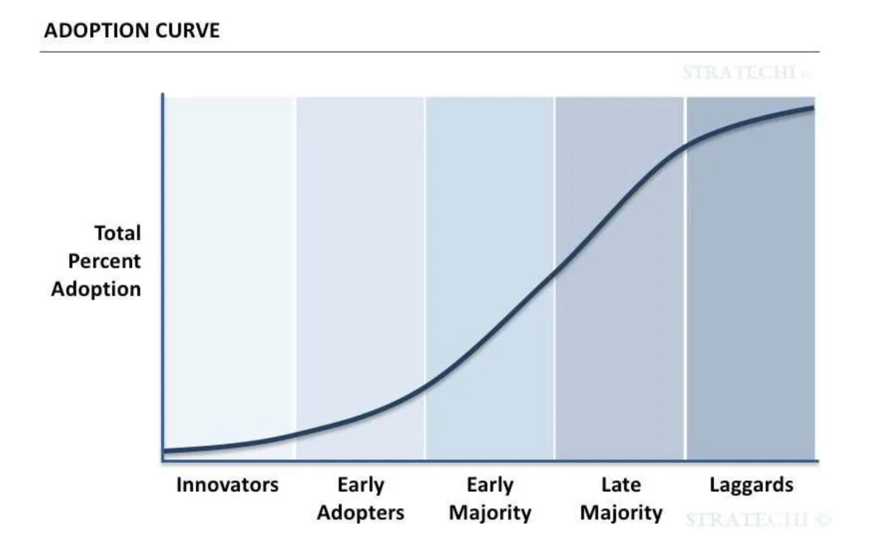
See, truly disruptive technologies don’t grow linearly. They follow S-curves of adoption:
Innovators (true believers) trickle
Early adopters follow slowly
Organic traction accelerates
Mass adoption occurs
The last believers (the true skeptics) trickle in
This creates a curve of users, as the chart above shows. But the pricing of assets that follow this s-curve of user adoption is not so pretty.
In fact, it is downright violent at times.
The result? Many investors get shaken out just before the compounding begins.
Let’s take Amazon, for instance.
Amazon is the poster child for adoption volatility. After surging to $113 in the dot-com boom of late 1999, AMZN collapsed to just $5.51 by 2001—a 95% drawdown.
This is what that looked like percentage-wise:
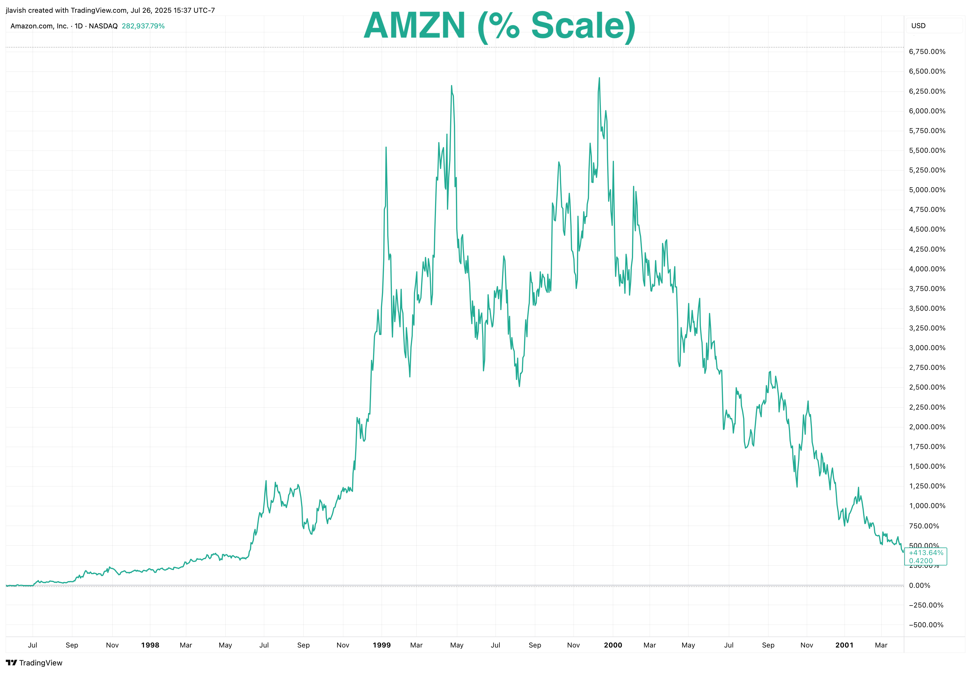
Of course Wall Street bros laughed and scoffed, said its was dead. Hedge funds shorted the snot out of it.
Amazon and Jeff Bezos were simply dismissed as speculative nonsense, a financial joke.
In fact, Julian Robertson, founder of legendary Tiger Management, famously shorted Amazon, unable to reconcile its valuation with traditional metrics. That short pretty much sealed the fate of Tiger which shut its doors in 2000, returning all the capital to investors.
Unfortunately for Julian, the market wasn’t wrong—it was just early and looking for the right price. This made the stock insanely volatile.
This cycle plays out because markets are forward-looking but impatient. They try to price exponential futures using linear thinking, and the result is violent volatility.
In the early stages of adoption, prices swing wildly—not because the asset is broken, but because the world hasn’t caught up yet.
In reality, the same adoption-phase volatility has hit almost every exponential technology:
Electricity (1880s–1910s): Sporadic, city-by-city rollout with constant skepticism.
Automobiles (1910s–1930s): Dozens of failed companies before Ford and GM emerged.
The Internet (1990s–2000s): The dot-com crash wiped out 80% of market cap—but not the Internet.
Nvidia: Flat for years while building the GPU stack that would power the AI revolution.
Bitcoin: Four drawdowns of 80%+—yet the best-performing asset of the last 15 years.
Volatility is not a sign of failure. It's the natural result of exponential potential crashing into linear expectations.
Breakthrough technologies begin with messy charts. But under all that noise is a long-term adoption curve, growing conviction, and compounding value—obvious only to those who consistently zoom out.
Bottom line: volatility is a necessary byproduct of exponential potential.
Unfortunately, for investors, that means stock charts often look confusing and include a ton of noise.
🫣 The Noise of Volatility
When we talk about stock charts, we usually (almost always) refer to the simple linear price charts that show the dollar price of the stock on the y-axis (vertical) and the time period on the x-axis (horizontal).
And because of this, linear price charts create challenges when analyzing assets that compound.
By plotting dollars on the y‑axis with equal spacing, they make late‑stage price swings look apocalyptic and early history look irrelevant.
Like so:
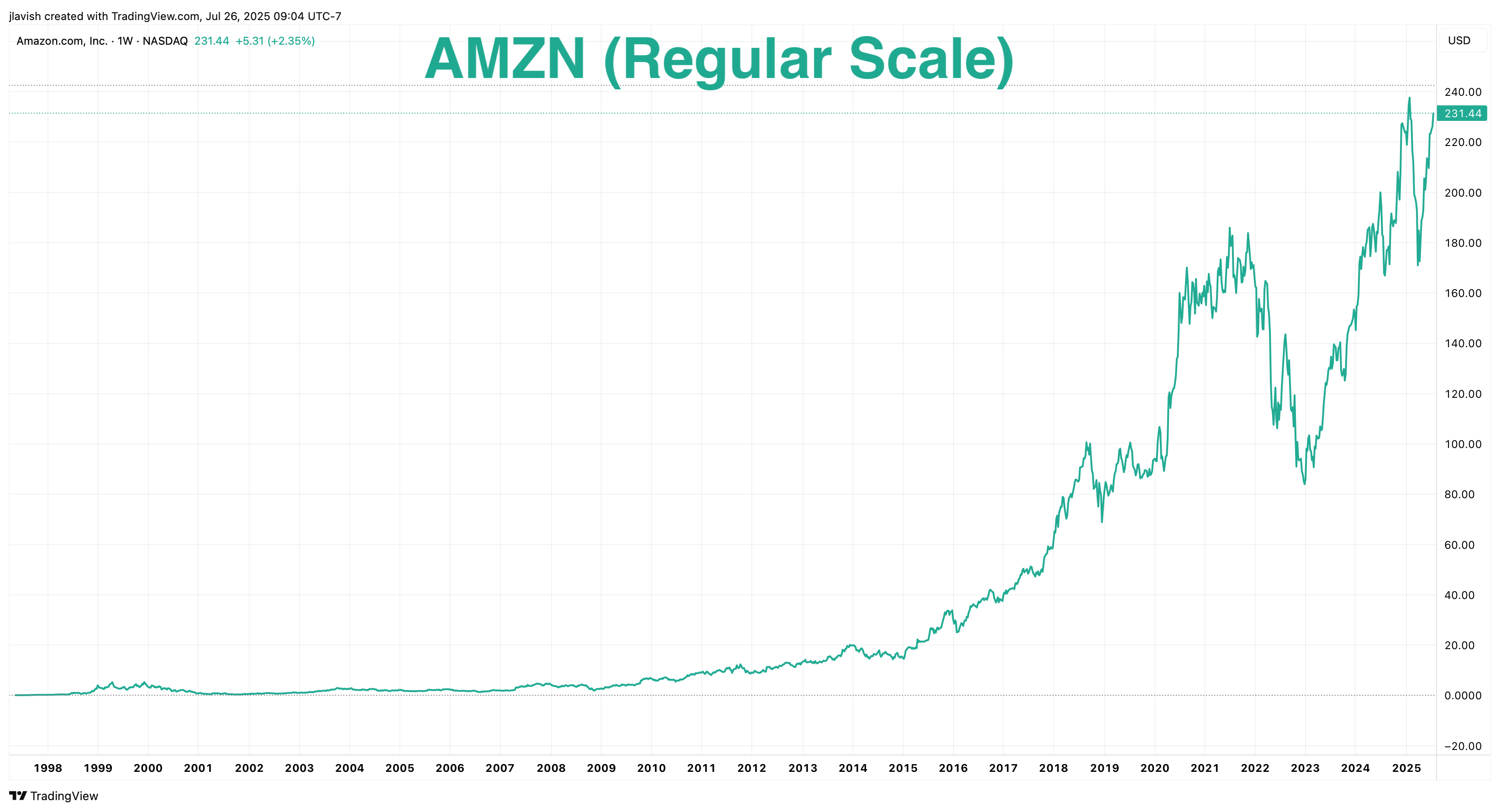
A $20 move near $200 (which is 10%) visually towers over a $2 move near $20 (also 10%), even though the mathematic significance is identical.
The result is an optical illusion: the more successful an asset becomes, the more its recent price action dwarfs everything that came before.
Exponential adoption reads as chaos.
Look back at the historic AMZN chart in the first section and then at the one above.
Do you see it?
The dot‑com surge and collapse of 1999 to 2001 looks like a murder scene in the first chart and mere stubbed toe in this one.
From roughly 2015 onward, each dollar of price change is so large in absolute terms that the chart seems to re‑write Amazon’s history in real time. Looking only at the linear version, you might conclude Amazon was a newly-minted meme stock that became a rocket ship overnight.
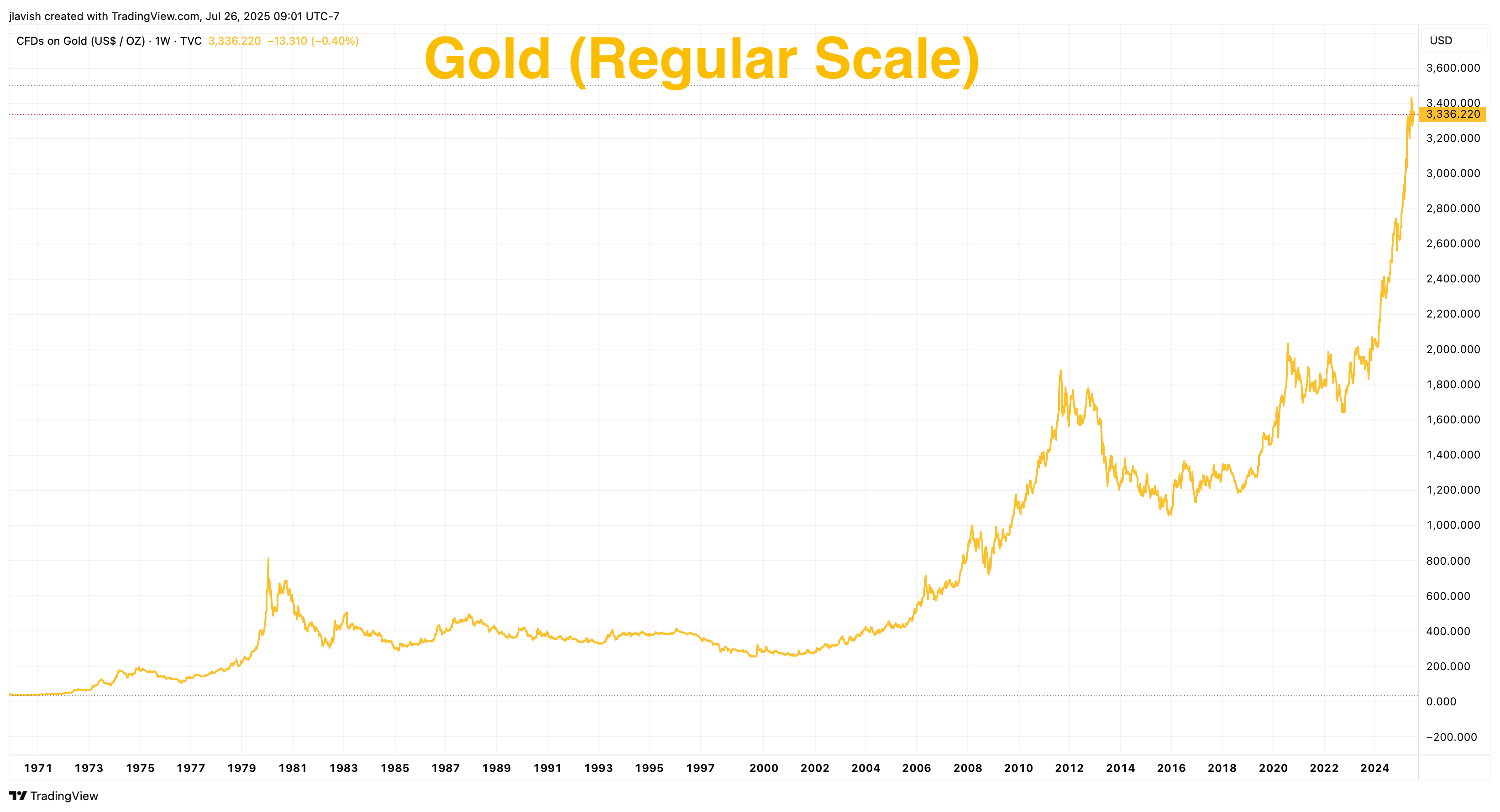
Gold is no different.
On a linear chart spanning from 1971 (we all know what happened, there, right? The Nixon Shock, taking us off the Gold Standard completely…)
Anyway, look at the chart since then. A fair amount of chaos.
Now look at Bitcoin on a linear scale.
The poster child of volatility.
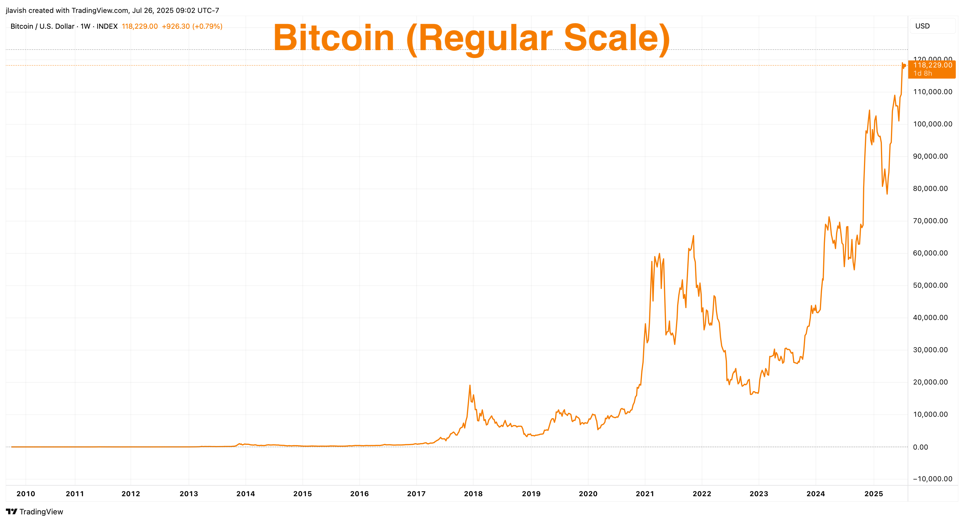
Yikes.
Who in the world would want any of that psychological torture???
The early cycles that defined its adoption—2011, 2013, 2017—disappear into barely visible ripples, while the most recent move overwhelms the frame.
Linear scaling makes the present look unprecedented, even when the percentage changes are entirely in line with prior cycles.
This is exactly how investors get whipsawed: they anchor to the amplitude of today’s dollars rather than the rate of change that has characterized Bitcoin since inception.
What these three linear charts have in common is not just volatility; it’s scale bias.
Huh?
See, linear price charts show absolute dollars rather than proportional change, so they exaggerate the drama of maturity and trivialize the effects of early compounding.
The human eye reads cliffs and plateaus, not basis points and CAGR. That’s fine if you’re a day trader needing to react to Tweets or headlines. It’s disastrous if you’re trying to understand the economics of adoption of a technology and keep a long-term view on your investment.
There’s a second problem with linear charts: they obscure comparability across cycles.
What do I mean?
When percentage moves are the unit that matters—as with new technology being adopted—the only way to judge whether the current move is “unprecedented” is to compare like with like.
Linear scaling prevents that comparison by changing the yardstick every time price level changes.
A 60% drawdown early in Amazon’s life and a 60% drawdown decades later are identical in risk terms, but one is a tiny wiggle and the other is a canyon on a linear chart.
Investors looking at the picture, not the math, conclude the later event is categorically worse.
It isn’t.
Finally, linear charts create narrative error.
They make it easy to believe that “nothing happened for years and then everything happened at once,” which is a great storyline for short sellers and skeptics.
In reality, adoption, capacity build‑out, profitability, etc. almost always arrive in uneven timelines.
Price anticipates this, overshoots it, and then retraces—over and over—while the underlying trajectory compounds beneath the surface (the long-term S-Curve).
The right lens—or viewpoint—should reveal that pattern, not hide it.
And this, my friends, is where the log chart comes into play.
🤓 The Log Solution
Put simply, if linear charts are an optical illusion for compounding assets, logarithmic charts are the corrective lens.
How?
A log scale does one simple but powerful thing: it measures proportional change instead of absolute dollars.
On the y‑axis, the spacing is by equal ratios—1, 2, 4, 8… or 10, 100, 1,000—rather than by equal dollar increments.
Read that again, slowly.
What this means is a move from $10 to $20 (a 100% gain) takes up the same vertical distance as a move from $1,000 to $2,000 (also 100%).
Likewise, a 50% drawdown is the same vertical drop whether it happens at $20 or $200,000.
When you make that switch, the chaos of adoption becomes something intelligible, much easier to interpret.
So, using log, what do we see with the pricing of assets that are being adopted?
Constant growth rates become straight lines.
Drawdowns become comparable across cycles because a −60% fall is the same geometric event every time; on a log scale, it shows up as the same step down anywhere on the chart.
Let’s go back to our three assets, starting with AMZN.
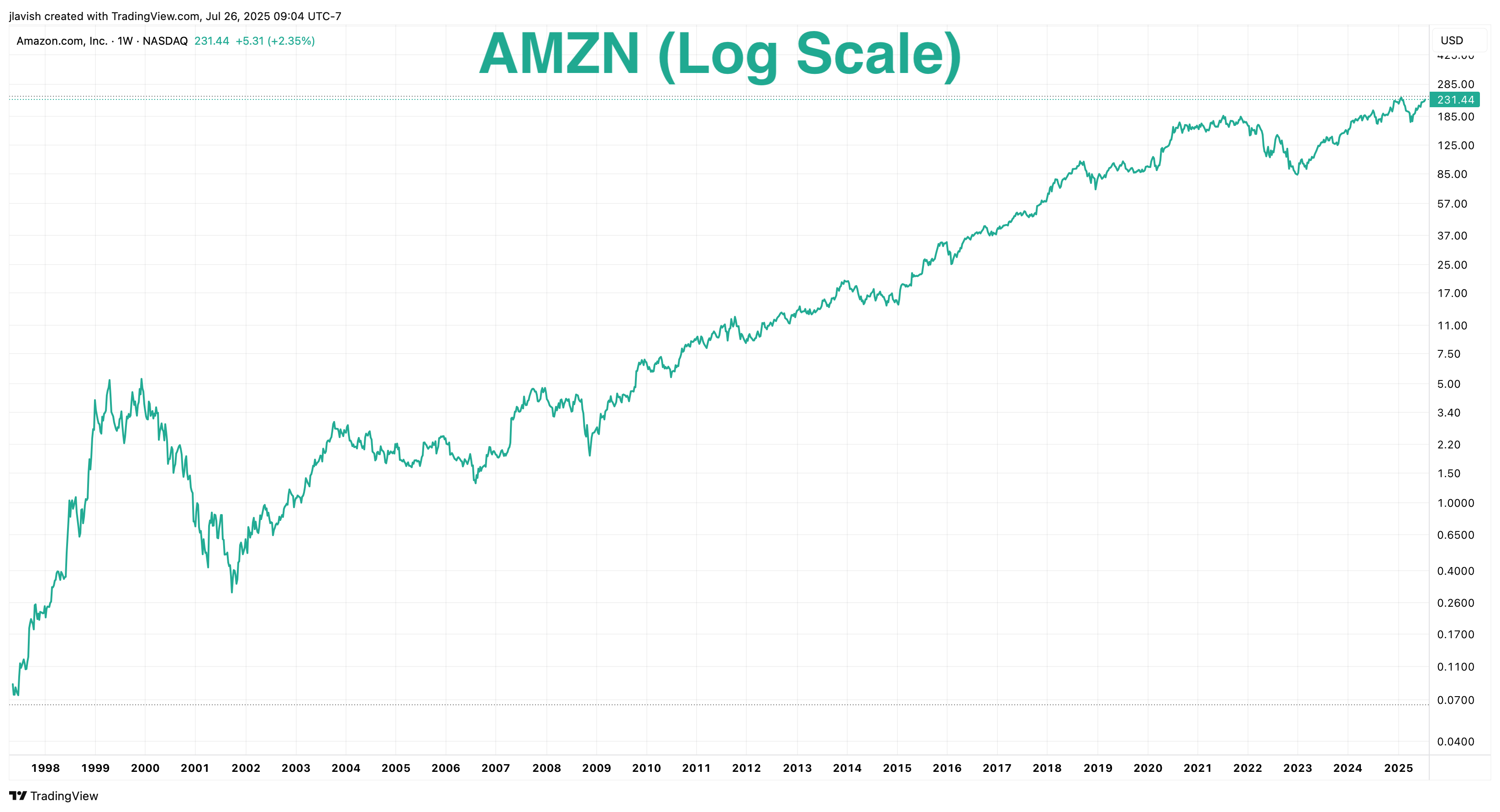
See that steep line of adoption?
And that the volatility of early years of 1999 to 2001 are represented properly?
On a linear chart, the dot‑com collapse dwarfs the entire 2000s, and the post‑2015 advance seems to erase everything that came before it.
On a log chart, the 2003–2011 build‑out reads as a steady compounding slope, the AWS inflection shows up as a visible acceleration in that slope, and the later consolidation looks like a normal pause in a long compounding arc. The narrative shifts from “random cliffs” to “phases of growth at different speeds.”
All we did was change the y-axis (price scale) from linear to log, spacing the prices by equal ratios—1, 2, 4, 8… or 10, 100, 1,000—rather than by equal dollar increments.
What about Gold?
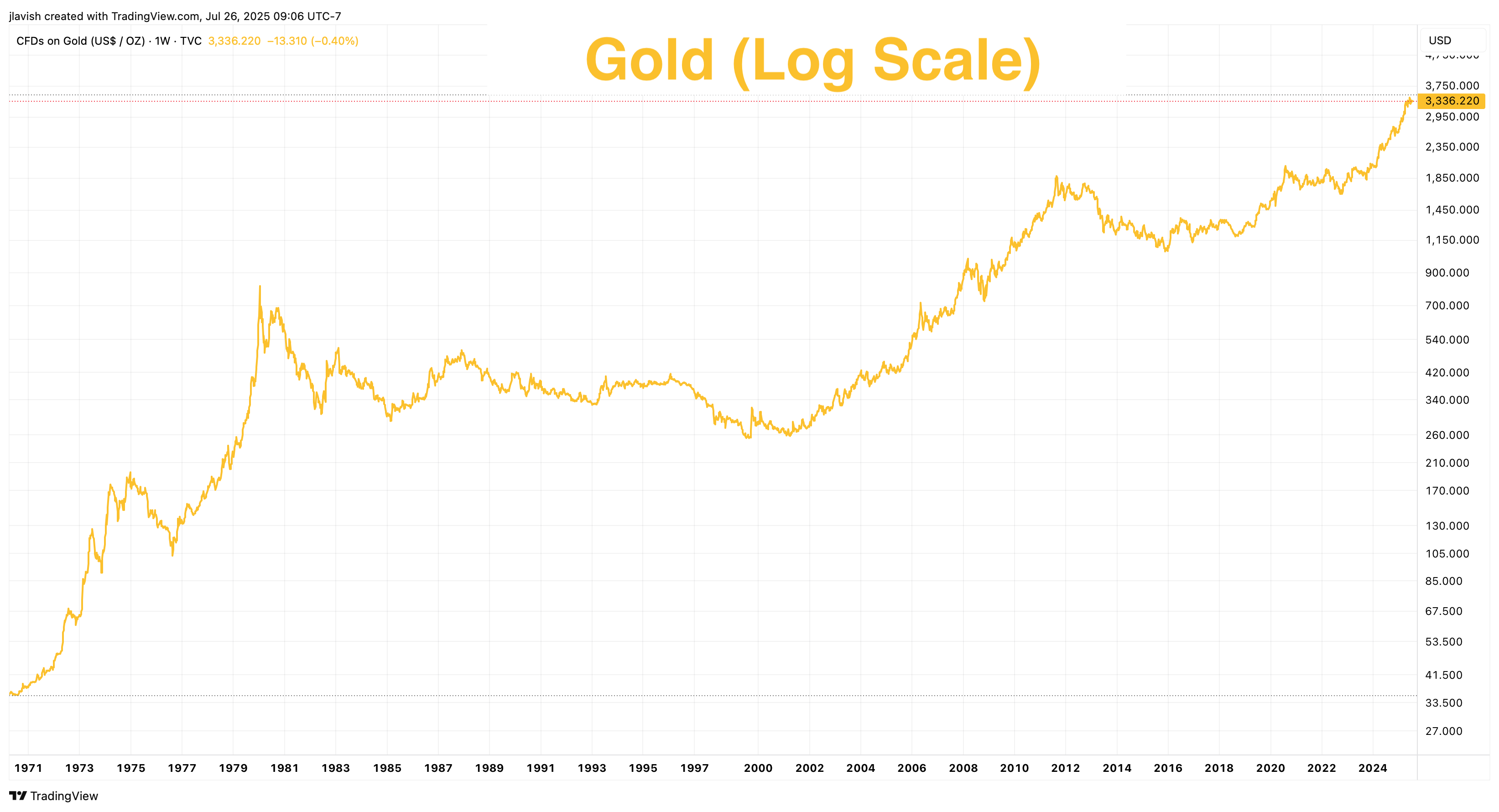
Well, how about that? Pretty similar.
The steep, regime‑driven revaluation after 1971 and the surge into 1980, the multi‑decade consolidation that followed, and the renewed advances in the 2000s (due to market risks and money printing) are shown cleanly as distinct slopes on a log chart.
Instead of a single, jagged “explosion” crowded to the right edge, you see a century‑scale monetary asset that periodically reprices and then grinds, with percentage moves you can compare across eras.
No surprise, then, this is exactly what happens when you re‑plot Bitcoin “regular vs. log.”
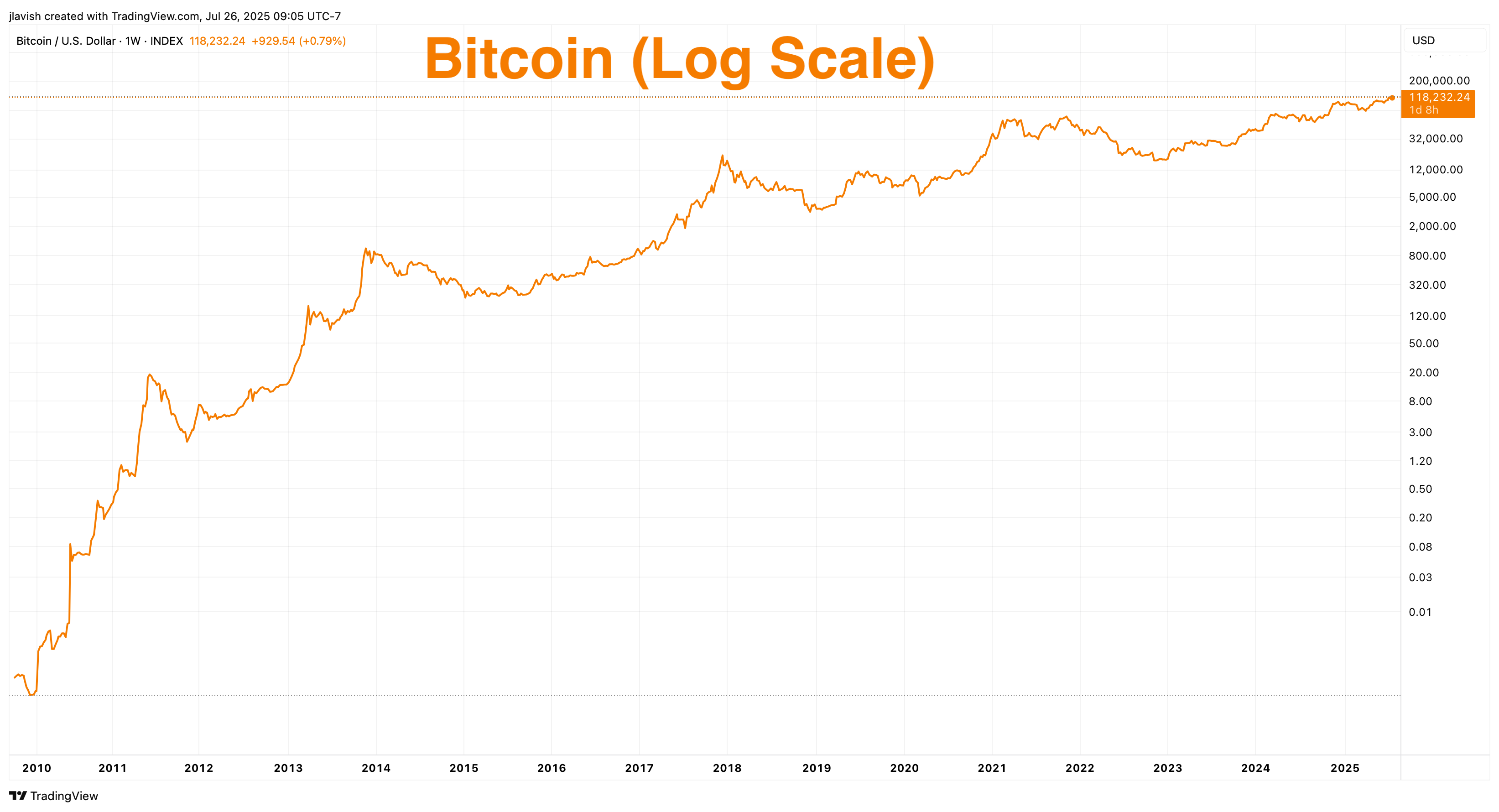
And there you have it. The madness of recent volatility is now a normal percentage move in the context of Bitcoin’s ongoing adoption phase.
To demonstrate the magnitude of noise we are talking about here, look at this chart by @ChartsBTC recently, with both linear and log together.
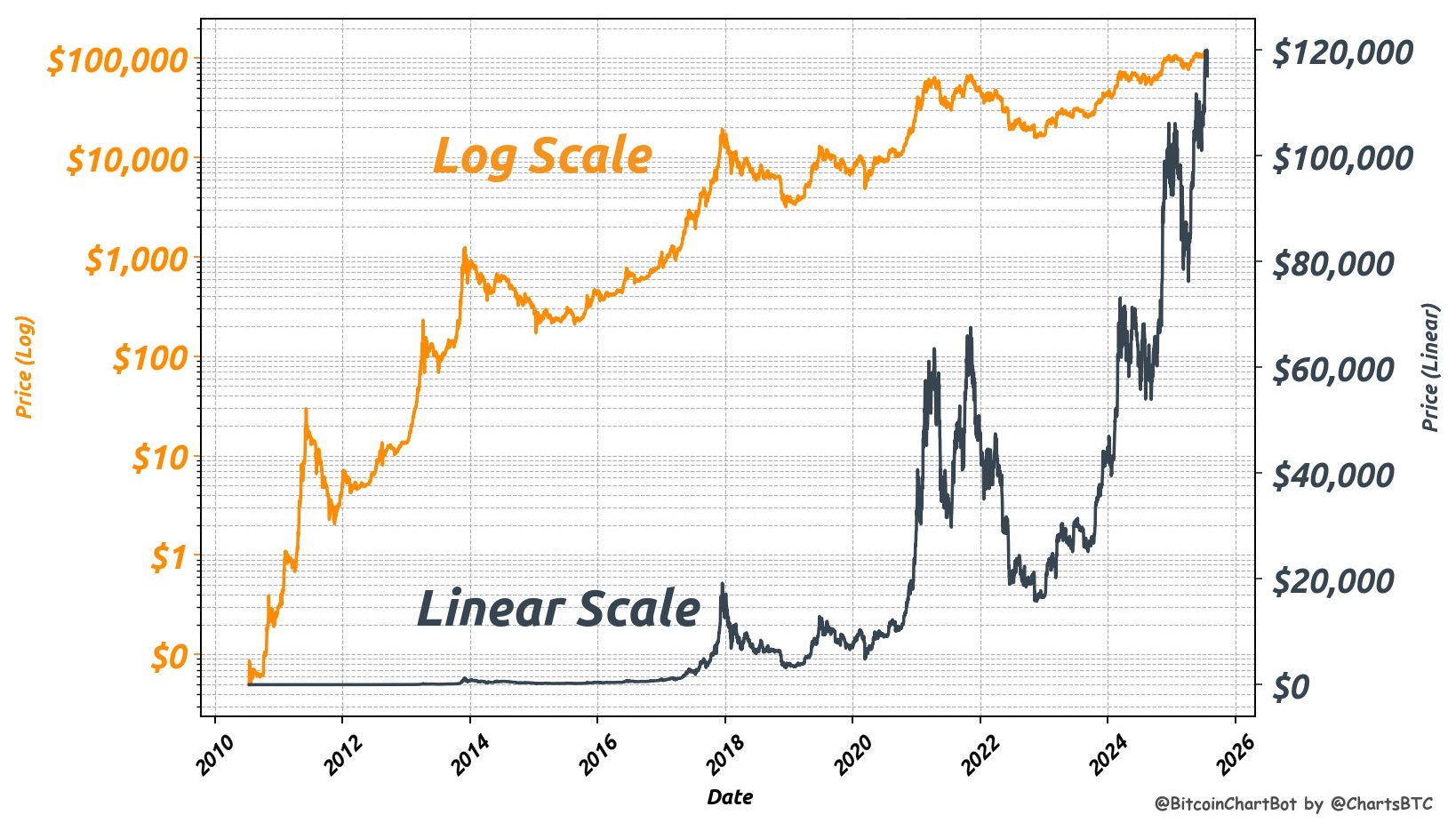
Once you look at the log chart, it is hard to even take the linear chart seriously for understanding long-term pricing moves.
Let me be clear: linear charts are essential for active traders and day traders—I am not criticizing or dismissing their usefulness altogether. Rather, I am talking about long-term investors and those who are looking to understand the adoption of new technology in the context of long-term price action.
That said, zooming out and looking at them side by side, the linear chart screams that the recent cycle is unprecedented, while the log chart shows a series of similarly sized percentage moves that seem to be normal—or even muted—in the context of Bitcoin’s history.
What looks like a singular blow‑off on the right side of the linear chart becomes just another oscillation around a rising trend on the log chart.
And so, you can effectively compare cycles on their significance—rates of change—rather than on the distracting size of today’s dollars.
But a log chart does not smooth reality or excuse volatility.
It contextualizes it.
If growth genuinely decelerates, the slope will flatten. If adoption breaks, the line will break. But by using proportionality, log charts put the investor’s focus back on compounding.
OK, so what does that mean for Bitcoin going forward?
What happens next?
🤩 The Future of Bitcoin Price
We’ve seen how linear charts distort, and how log charts reveal the real story. But now, let’s go one simple step further.
Since Bitcoin has followed a consistent pattern of adoption, can we use that pattern to get a sense of where the price might go over the next 5 to 10 years?
That’s where Power Law charts come in.
If you have not heard about Power Law or need a refresher on it, I wrote a whole newsletter all about it recently, with my perspective, that you can find right here:

For today’s purposes, and to put it simply, the Power Law becomes a straight line when you plot Bitcoin’s price and time on a log-log chart—where both the price and time axes are logarithmic. This helps reveal long-term consistency in growth that may look chaotic on a normal price chart.
Like so, as another chart by @ChartsBTC shows:
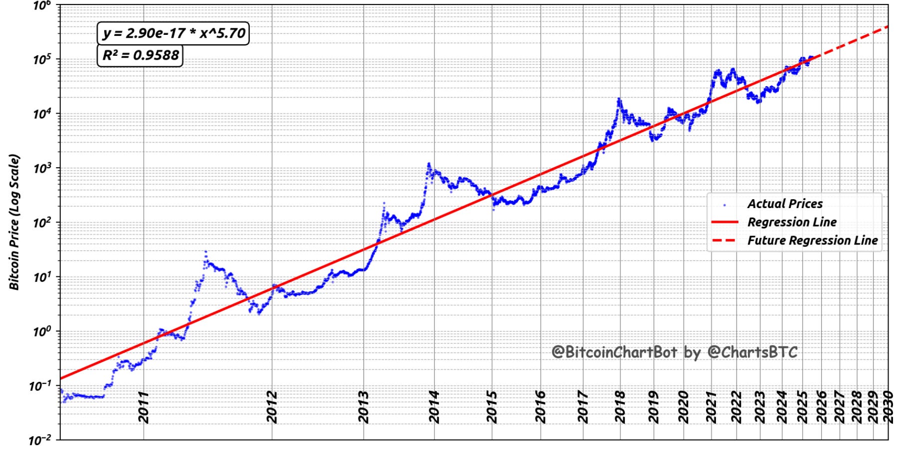
What you see here is the full history of Bitcoin, and how tightly it has followed a predictable curve (straight line) over time. The blue line is the actual price. The red line is the Power Law model.
And it fits almost perfectly.
This is what’s remarkable about Bitcoin: for all its volatility, its price has steadily climbed along the same path for 15 years.
It’s not magic, it’s not coincidence, and it’s certainly not a bubble—it’s true adoption.
As more individuals and more institutions understand and recognize Bitcoin’s value, the price climbs.
And even when it crashes, it eventually snaps right back to the long-term curve.
What if we take that concept and chart it on a normal time scale (the Power Law model remains, but we show it on the scale that our brain can recognize easier)?
It looks like this:
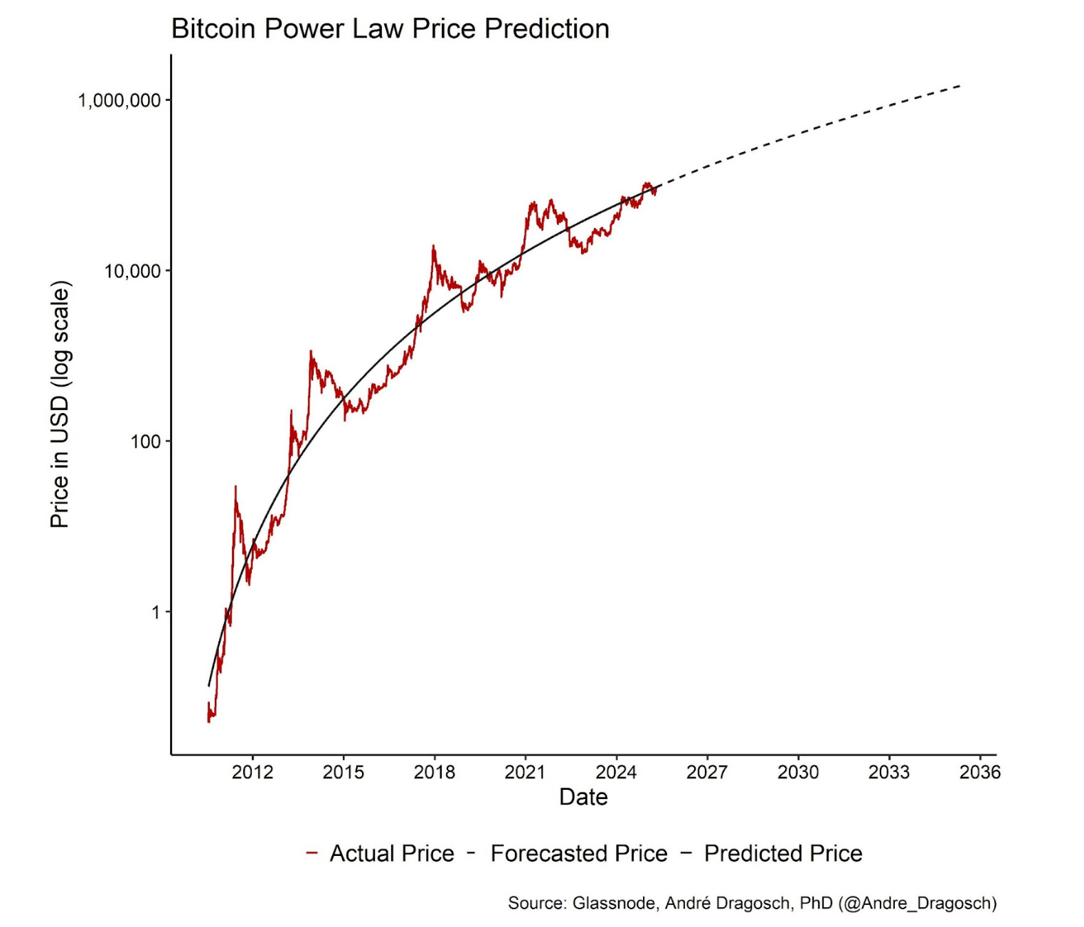
On here, the underlying model is still a Power Law, but the time scale is normalized. This helps us see what analysts mean when they say Bitcoin follows a power law: its long-term price trajectory scales predictably with time, and when we view it through the right lens, the noise fades and the pattern emerges.
And so, if we believe that adoption follows the price action of many other adopted technologies in a Power Law curve, then we believe that we’re likely to see Bitcoin in the $250,000 to $1 million range sometime between now and the early 2030s.
Of course, nobody knows exactly when. And the model doesn’t predict what Bitcoin will do next week or next quarter. But it gives us a reasonable map of the long-term trajectory.
But remember, even within this strong trend, we should still expect significant volatility. Massive rallies and then huge drawdowns with 50–70% corrections. That’s the price of adoption-curve upside.
Remember: Bitcoin’s price may look chaotic on a regular chart.
But zoom out.
Adjust your lens.
When you do, it becomes clear: this isn’t randomness—it’s adoption.
And when viewed through the logarithmic chart lens, the future of Bitcoin doesn’t look like a tulip or a bubble.
It simply looks like math.
That’s it. I hope you feel a little bit smarter knowing about log charts and how they can be useful to filter out the noise of price charts of technology in the adoption phase.
If you enjoyed this free version of The Informationist and found it helpful, please share it with someone who you think will love it, too!
Talk soon,
James✌️
This is great stuff. Thank you!
clear as Glacial Water…