💡 The Misery Index
Issue 133
✌️ Welcome to the latest issue of The Informationist, the newsletter that makes you smarter in just a few minutes each week.
🙌 The Informationist takes one current event or complicated concept and simplifies it for you in bullet points and easy to understand text.
🫶 If this email was forwarded to you, then you have awesome friends, click below to join!
👉 And you can always check out the archives to read more of The Informationist.
Today’s Bullets:
What is Misery?
Is it Accurate?
Presidential Miseries
Misery Ahead?
Inspirational Tweet:
With all the talk of the economy possibly falling into ‘stagflation’, there is a growing feeling of discontent in the economy.
At least for the lower income demographic and those who have not benefitted greatly from owning assets like large houses or large stock portfolios.
But how do we measure this ‘discontent’? And are these feelings actually misplaced, as some mainstream media reporters suggest?
Well, this is where the Misery Index comes in handy.
And we are going unpack the index, its usefulness, as well as its accuracy, nice and easy as always, right here today.
So, grab a nice big cup of coffee and settle into a comfortable seat for some fun-filled Sunday morning misery speak with The Informationist.
😨 What is Misery?
In a word: Stagflation.
Some of you may have heard me talk about this phenomenon recently, and the growing risk that the US economy is about to experience it.
But for those of you who are new around here, stagflation is simply a stagnating or contracting economy accompanied with excess inflation.
In other words, opportunity and productivity is decreasing at same while at the same moment prices are increasing.
Not exactly ‘Joy’.
Problem is, it seems like Pelosi and other politicians are completely out of touch with this dynamic and believe that the economy is rocking along.
Like Congressmen and Senators, for instance, who can simply front run their own-enacted legislation and benefit greatly in their personal stock portfolios, generating millions of dollars of profits in mere weeks.
Eyes on you, Nancy Pelosi. 🤬
I digress.
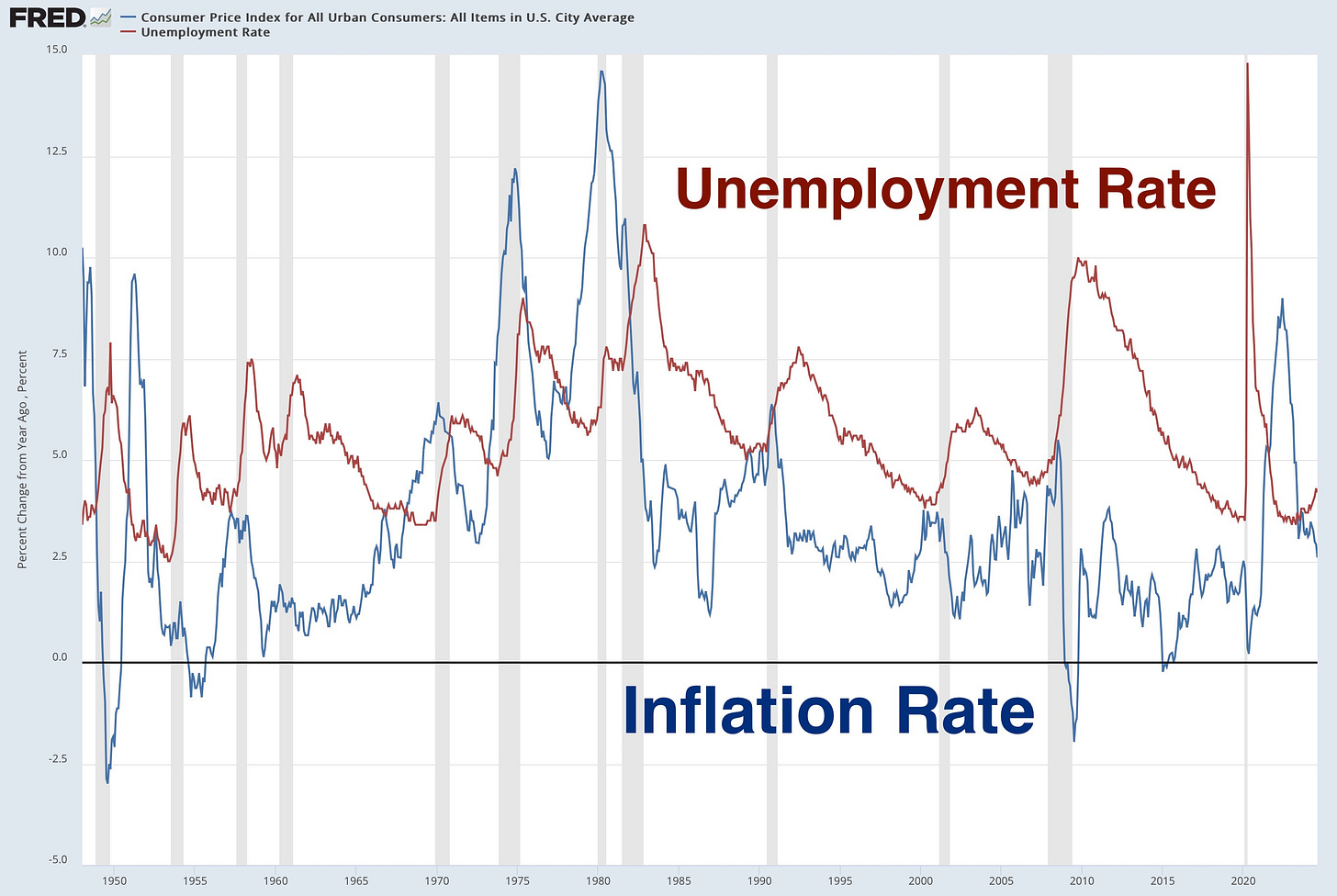
In any case, the discontent can be measured by the factors of contraction and rising prices.
That’s right, unemployment and inflation.
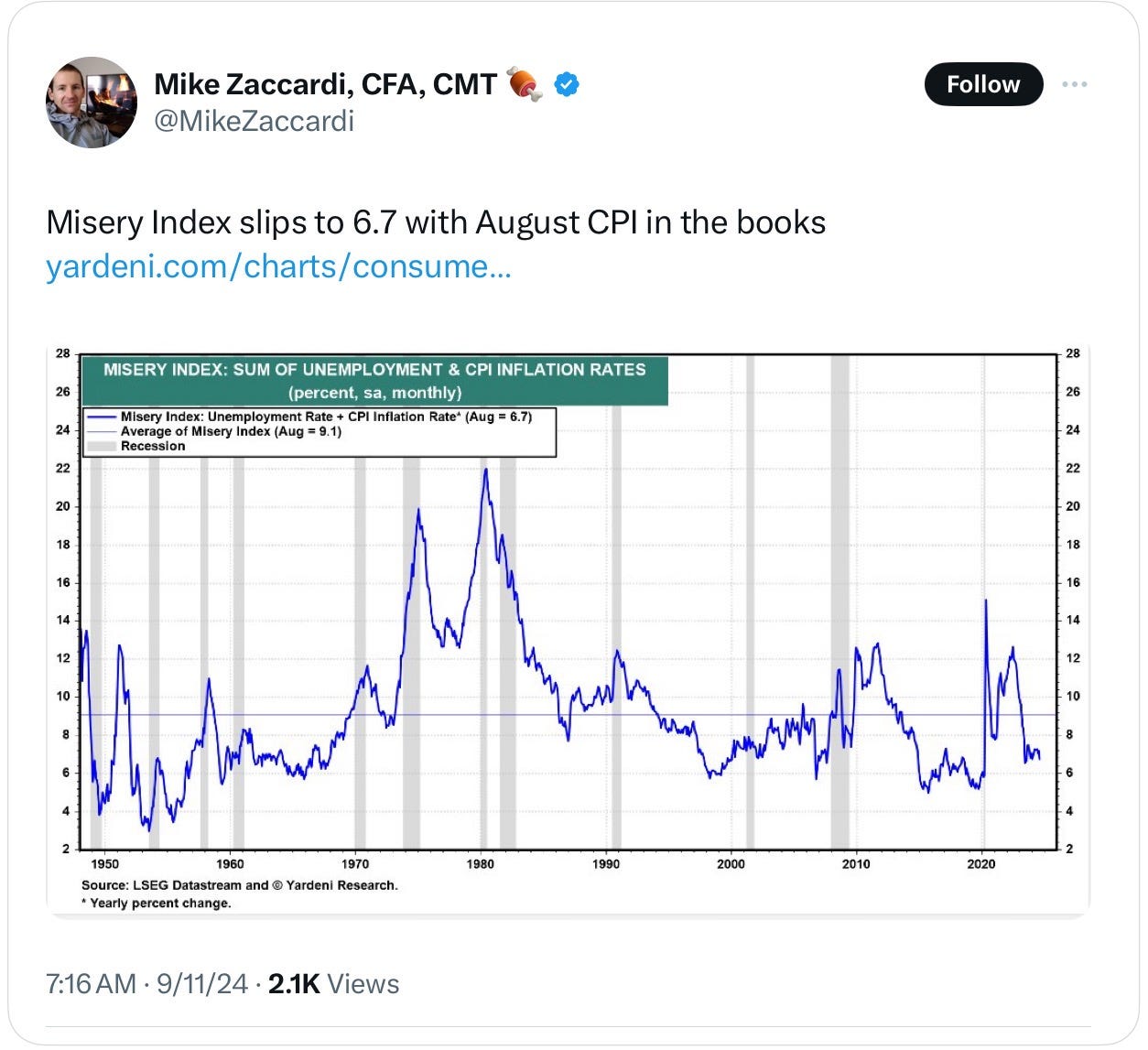
What we see is that the 1970s brought great misery to the US economy, with both rising unemployment and excess inflation.
Stagflation. 😱
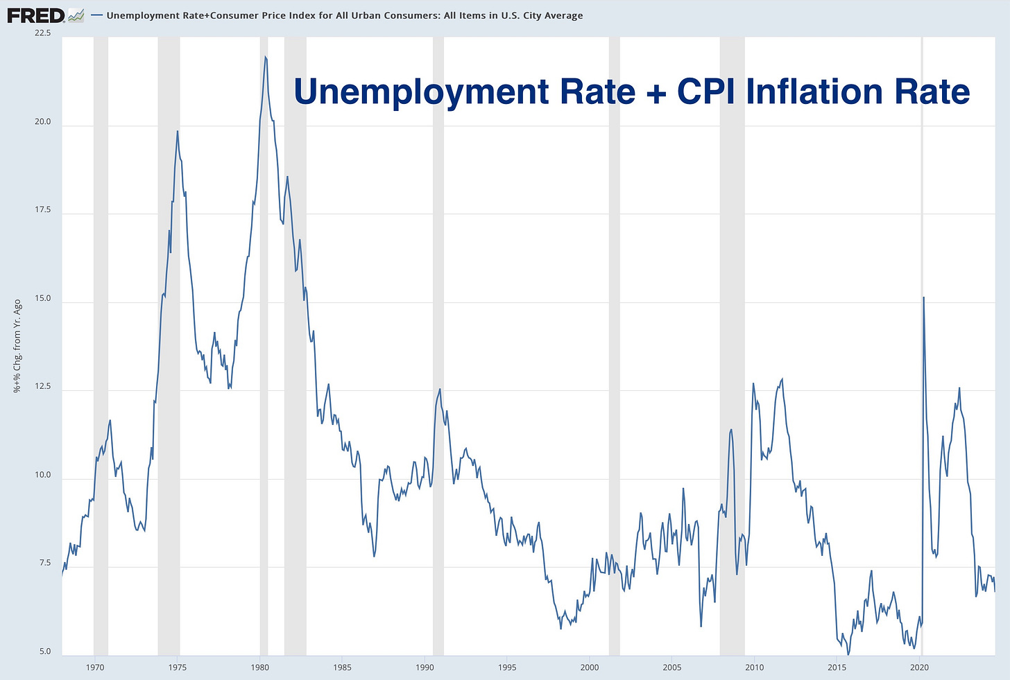
And so, when we add the unemployment rate and the inflation rate together, we get what is called the Misery Index. 😭
Like so:
No surprise, of course, the Misery Index spikes during recessions (grey bars above), as unemployment skyrockets.
Outside of that, though, how accurate is the misery index, really?
I mean, look at how high the misery index was in the 1990s, for instance. There was a short recession, but nothing like the GFC or 2020 lockdowns, just vanilla discontent.
Let’s have a look, shall we?
🧐 Is it Accurate?
One of the ways we measure consumer emotions and contentedness is with something called Consumer Sentiment survey.
Conducted by the University of Michigan, and while it has limited usefulness, in my opinion, this survey can generally be helpful when measuring how the consumer is ‘feeling’ at any given moment.
If you are interested in learning more about the University of Michigan Consumer Sentiment survey, I wrote a whole newsletter about it recently that you can find right here:
TL;DR: The University of Michigan conducts a regular survey of consumers, measuring their situations financially, as well as their expectations of the future, including inflation expectations. But the survey has its limitations, especially with its total reach.
It’s an interesting piece and I encourage you to have a read after this one.
In any case, (h/t to Lyn Alden for recently pointing this out recently), when we chart the Consumer Sentiment on the same graph as the Misery Index, we can see that they are inversely correlated:
The periods when the lines cross seem to be the periods of most discontent.
And when we check in on that 90s period, we see that consumer sentiment was, in fact, sagging while the Misery Index was rising.
Confirmation of the consumer’s personal financial position.
We see the same, of course, in 2009 and again in 2021.
But who is to blame for this? Is it the President or perhaps the political party in power?
Good question and one we will look at next.
🤥 Presidential Miseries
When we chart out the Misery Index versus the Presidential terms, we find a few interesting nuggets of information.


