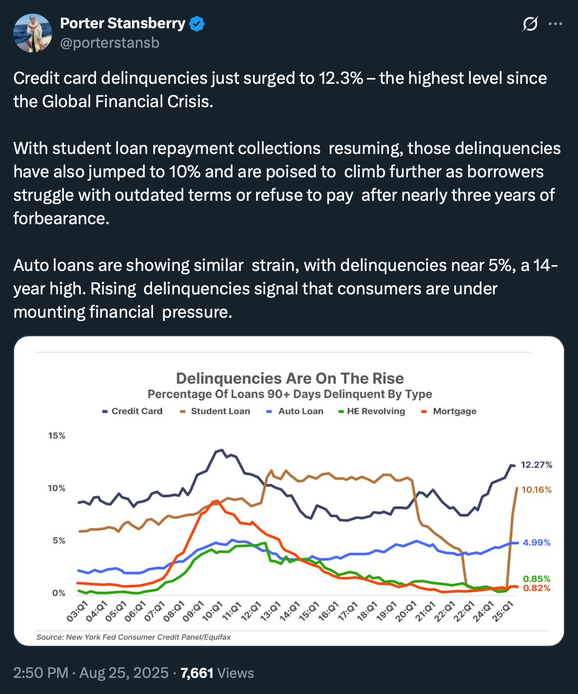
💡 The Looming Consumer Debt Crisis
Issue 181
✌️ Welcome to the latest issue of The Informationist, the newsletter that makes you smarter in just a few minutes each week.
🙌 The Informationist takes one current event or complicated concept and simplifies it for you in bullet points and easy to understand text.
🫶 If this email was forwarded to you, then you have awesome friends, click below to join!
👉 And you can always check out the archives to read more of The Informationist.
Today’s Bullets:
Understanding the NY Fed Report (And Why It Matters)
The Two-Headed Monster: Credit Cards and Auto Debt
A Word About Student Loans
Investment Implications (And What to Do About It)
Inspirational Tweet:
Ah yes, another quarter, another Federal Reserve "everything is fine" report. Except this time, as Porter points out, even the Fed can't spin the data into sunshine and rainbows.
See, the NY Fed's Q2 2025 Household Debt and Credit Report just landed on the desk like a brick through a window, and let me tell you—it's stuffed with warning signs.
And here's the beautiful irony: while Fed Chair Powell drones on in Jackson Hole about being “data dependent’”, his own bank just published a 46-page pending economic obituary.
Truth is, most people will glance at this report, see some big numbers, maybe catch a headline about total debt hitting $18.39 trillion, and move on with their lives.
Meanwhile, the people who actually understand this data have sat up, taken notice, and are prepping for the worst to come.
But what exactly are we looking at? What are we looking for? And what should we take away from it all?
Simple, but important questions that we will answer, nice and easy as always, here today.
So, pour yourself a big cup of coffee, and settle into your favorite seat for a look into the Fed’s ‘Consumer Credit Report’ with this Sunday’s Informationist.
🤓 Understanding the NY Fed Report (And Why It Matters)
Here's how this racket works: Every quarter, the New York Fed—you know, the guys who brought you "transitory inflation" and "the banking system is sound"—publishes what they call the Household Debt and Credit Report.
It's based on credit data from 267,000 Americans, or roughly 5% of everyone with a credit report.
Problem is, The Fed is acting like a professor who merely drops the worst test scores and then gives the student a final score of B+ or even an A.
But before we dive into the current carnage, let me tell you why this particular report is such a big deal and why serious investors look at it closely.
The Birth of America's Financial X-Ray Machine
To no surprise, the NY Fed Consumer Credit Panel was born out of the 2008 Financial Crisis, when everyone (i.e., The Fed) suddenly realized we had been flying blind into an economic hurricane.
Before 2008, we had bits and pieces of consumer debt data scattered across various agencies, but no comprehensive, real-time snapshot of how American households were actually doing.
Then the Fed—in a rare moment of self-awareness?—partnered with Equifax in 1999 to create what amounts to America's financial MRI machine.
But it wasn't until after the housing crisis that this data became all-so-important like it is today.
Why?
Because 2008 reminded us of an obvious but painful lesson: when consumers can't pay their bills, everything else falls apart pretty quickly.
Some of you may be asking, Why is the New York Fed in charge of this data, specifically?
Here's where it gets interesting.
The New York Fed isn't just any regional Fed bank—it's the crown jewel of the Federal Reserve System.
It's where all the serious financial market operations happen:
Treasury auctions, foreign exchange interventions, and all the backroom dealing with Wall Street's biggest players.
Remember in 1998, when Long Term Capital Management was about to collapse and Goldman Sachs engineered a Fed-led bailout with the other banks?
Yeah, that happened at the NY Fed.
And the rescue of Bear Stearns in March 2008? Orchestrated by none other than the NY Fed, who provided billions in financing and a $30 billion credit line to JP Morgan Chase to acquire the investment bank.
The NY Fed also publishes the Effective Fed Funds Rate, the Overnight Bank Funding Rate, and the new form of LIBOR, the Secured Overnight Financing Rate (SOFR) rate.
And so, because it is the NY Fed who interacts with the financial markets daily, the NY Fed gets the consumer data, too.
After all, they want to know in real-time whether consumers are about to implode, because consumer spending drives roughly 70% of US GDP. When this data goes bad, the NY Fed is usually the first to know that it’s time for emergency measures.
This is also why the report carries more weight than similar data from other agencies.
When the New York Fed speaks, Wall Street listens—because (as we see above) these are the people who will be implementing whatever emergency policies come next.
The Methodology That Makes Wall Street Sweat
The Household Debt and Credit Report tracks a ‘nationally representative’ 5% random sample of all Americans with credit reports—currently about 44 million people each quarter, though they use a smaller subset of about 267,000 for the detailed analysis to keep processing costs manageable.
But here's the smart part: it's longitudinal.
This means that they follow the same people over time, so they can track exactly how financial stress spreads through the population. It's not just a snapshot—it's a financial movie, showing how debt problems evolve from manageable to catastrophic.
Sometimes, as we have seen, it’s far too late. But hey, this is the government, remember.
Or is it?
In any case, the data comes from Equifax credit reports.
And this means that it captures virtually every form of consumer debt: mortgages, credit cards, auto loans, student loans, home equity lines of credit, and even third-party collections.
If you owe money to someone who reports to credit bureaus, it's in this data.
Why Serious Money Follows This Report
Here's why hedge funds, pension managers, and sovereign wealth funds treat this report like financial scripture: it's a leading indicator, not a lagging one.
Well, sort of.
How?
Consumer credit stress shows up 6-12 months before it hits corporate earnings.
When people start missing credit card payments, they cut discretionary spending (unnecessary items, like going to the movies and sporting events or going on vacation).
When they cut this spending, restaurants and retailers see earnings pressure. When earnings disappoint, stock prices fall. The dominos are relatively predictable—if you know where to look.
Smart money also knows that this report reveals geographic clustering of financial stress.
Just like 2008, financial problems don't spread evenly—they cluster in specific states and cities first, then spread outward. The Fed report breaks down delinquencies by state, giving you a roadmap of where the next foreclosure crisis might unfold.
But perhaps most importantly, institutional investors use this data to position for Fed policy changes. Like raising or lowering rates, or implementing QE (aka money printing).
The Six-Week Truth Delay
Though it is a leading indicator amongst terribly lagging ones (like pretty much anything out of the Bureau of Labor Statistics), the report itself still lags the data it is logging, severely.
Like six-weeks severely.
And so, the Q2 2025 data we're looking at reflects what was happening in April, May, and June—not what's happening right now in August.
We can extrapolate then, that the real-time situation is almost certainly worse than the data.
Think about what's happened since June: more layoffs, continued high interest rates, back-to-school expenses, and the general grinding effect of sustained inflation on household budgets.
This lag is both a blessing and a curse for investors.
It's a curse because the data is already old by the time you see it. But it's a blessing because it gives you a roadmap of what's coming. If Q2 data shows serious stress, Q3 is likely to be worse, and Q4 could be a disaster.
So how bad was it?
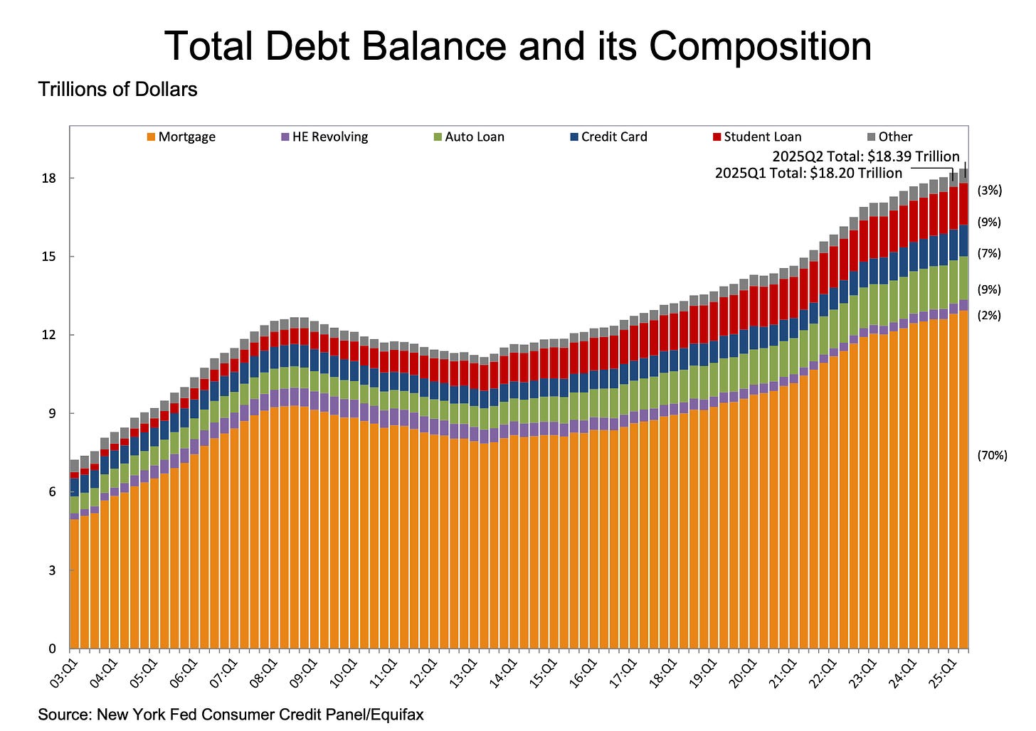
Well, as we said at the beginning, total household debt hit $18.39 trillion in Q2.
That's $185 billion more than Q1, and a whopping $4.24 trillion more than we had at the end of 2019.
Since these numbers are so large, some context: that's like adding the entire GDP of Germany to America's debt pile in just five and a half years.
This chart shows the breakdown of that $18.39 trillion.
What we notice is that mortgages dominate at 70%, but also that credit cards, auto loans, and student loans each represent massive chunks.
This is your baseline for understanding where Americans are actually borrowing.
Now, the total debt number is what mainstream media will tirelessly report because big numbers get clicks. But quoting total debt is like checking someone's weight—sure, it matters, but it doesn't tell you if they're healthy or dying.
What actually matters are the delinquency rates—specifically, how many people are falling behind on payments.
Because when Americans can't pay their bills, they stop buying stuff. And when Americans stop buying stuff, that whole "consumer spending drives 70% of GDP" thing becomes a problem.
See, when consumer credit stress reaches certain levels, three things happen with mathematical precision:
First, consumer spending cuts follow within 2-3 months. People who can't make minimum payments on their credit cards aren't buying new clothes, eating out, or booking vacations.
Second, corporate earnings guidance gets slashed 6-9 months later. Companies start seeing the impact in their quarterly results and begin warning investors about softening demand.
Third, unemployment starts rising 12-18 months later, as companies respond to falling demand by cutting costs—starting with payroll.
The sequence is so predictable that seasoned investors use this report to position for entire economic cycles. They're not waiting for the unemployment rate to spike or for corporate earnings to disappoint.
They're reading the tea leaves in consumer credit data and positioning months ahead of the obvious signals.
Knowing that, let’s dig into the default data, shall we?
🫣 The Two-Headed Monster: Credit Cards and Auto Debt
Let's start with the two debt categories that may make the hair on the back of your neck prickle.
Because we're not just approaching 2008 levels in these categories—in some cases, we're already past them.
The Credit Card Catastrophe


