
💡 The Buffett Indicator is Flashing BRIGHT RED
Issue 154

✌️ Welcome to the latest issue of The Informationist, the newsletter that makes you smarter in just a few minutes each week.
🙌 The Informationist takes one current event or complicated concept and simplifies it for you in bullet points and easy to understand text.
🫶 If this email was forwarded to you, then you have awesome friends, click below to join!
👉 And you can always check out the archives to read more of The Informationist.
Today’s Bullets:
What is the Buffett Indicator?
A Little History
Flashing Bright Red
Investing in Froth
Inspirational Tweet:

There is no denying, US stock prices are rich and the valuations versus pretty much any historical measure are stretched.
But can we trust these indicators? What if stocks do just keep going…up?
Well, there is one indicator that’s been pretty much bulletproof when identifying a bubble, and it’s called The Buffett Indicator.
If you haven’t heard of it before or the thought of classic investing metrics scares you, have no fear.
Because we are going to walk you through the indicator, some history of its success, and what it is telling us now.
And we’ll also look at some nuances that have come about since the last ‘bubble’, as well as how to protect your portfolio against the unexpected.
And we will do it nice and easy, as always.
So grab yourself a big cup of coffee and settle into a comfortable chair for a little market bubble talk with this Sunday’s Informationist.
🧐 What is The Buffett Indicator?
First things first, the Buffett Indicator is one of the simplest and most straightforward metrics we have out there when looking at just how over or under-valued stocks have become.
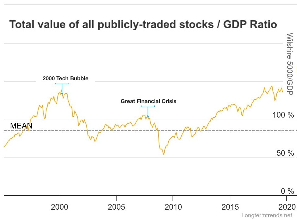
Named by and after Warren Buffett himself, it is simply the ratio of total stock market capitalization to GDP.
It basically looks at all the stocks in the US market—hence why the index used is the Wilshire 5000, as it represents the total stock market capitalization of all publicly traded U.S. companies—and measures the total value against the current level of US GDP, or Gross Domestic Product.
A ratio near 100% suggests fair valuation
A significantly higher ratio indicates frothy markets where stocks trade at high premiums to economic output
Historically, extreme readings have preceded major market corrections
But why? What is the significance of US GDP, or total production of the US economy in US dollars versus the value of the stock market?
Well, I love first principles, and this is one of those, IMO, where it makes intuitive sense that expansion and contraction of the economy (measured by GDP) should have a direct impact on the expansion and contraction of the stock market.
Think about it.
In the most basic terms, stock prices are ultimately tied to corporate earnings, which in turn depend on economic output.
Along with this, Hyman Minsky’s Financial Instability Hypothesis argues that financial markets are inherently prone to cycles of stability and crisis. And during long periods of economic stability, investors take on increasing levels of risk and leverage, leading to speculative bubbles.
uhm…
And so, eventually, excessive debt and risk-taking triggers a financial crisis, forcing a rapid deleveraging and market collapse, which is how stability itself can become destabilizing.
A lot of this is caused by liquidity-driven market cycles, which explain why market cap can outpace GDP in periods of easy money.
Well, well, well. That sounds familiar after the Fed printed $5 trillion from 2020 to 2022.
In any case, there’s also a bit of a feedback loop in the metric, as financial markets and the real economy clearly influence each other—especially in the US, where the economy is highly financialized.
Like so:

GDP (Economic Output) → Corporate Earnings
As the economy grows, companies generate more revenue and profits
Corporate Earnings → Stock Prices
Higher earnings should drive stock prices higher, as investors expect future growth
Stock Prices → Market Cap (Total Valuation)
Rising stock prices increase the overall market cap of publicly traded companies
Market Cap → GDP Feedback Loop
If stock valuations grow much faster than GDP, it signals speculation and liquidity-driven excess rather than fundamental economic growth.
So how has the Buffett Indicator performed over the years and though the last number of cycles?
🤓 A Little History
The Buffett Indicator has historically spiked before major market downturns, often following a pattern of exuberance (as we noted above, in the Hyman Minsky’s Financial Instability Hypothesis), where extended periods of stability lead to excessive risk-taking and eventual crisis.
Let’s see how it played out in the last two major crises before 2020.
Dot-Com Bubble (2000) – Classic Speculative Mania
The late 1990s saw a completely irrational stock buying frenzy fueled by internet startups most with absolutely no earnings. Investors ignored traditional valuation metrics and instead assumed endless future growth.
The Buffett Indicator peaked at ~140% before the market lost nearly 50% of its value.
The feedback loop:
Rising stock prices led to increased speculative interest and capital inflows
New IPOs flooded the market, further inflating valuations as companies raised funds despite weak fundamentals
Investors took on leverage (margin debt skyrocketed) to chase further gains
Corporate earnings failed to justify valuations, leading to a slow unraveling
The crash: the bubble burst, companies with no real earnings collapsed, triggering massive losses across tech stocks and a broader market downturn
This exemplifies Minsky’s hypothesis: long periods of stability encouraged excessive risk-taking, leading to an inevitable collapse.
Great Financial Crisis (2007-2009) – Leveraged Ignorance and Stupidity
Unlike the tech bubble, the 2008 financial crisis was a crisis of leverage and systemic risk, primarily in the housing market and banking system.
The Buffett Indicator hit ~105% before the crisis unfolded, suggesting that valuations were stretched but not quite as extreme as in 2000.
So what happened?
Early stability in housing prices encouraged more lending and speculation
Financial innovation (subprime mortgages, mortgage-backed securities, credit default swaps) masked underlying risks
Excess liquidity and leverage allowed home prices to inflate beyond fundamental value
Investors and bankers ignored credit risk, assuming the system was just too big to fail
Shock event: Rising default rates cracked the illusion of safety, leading to a bank liquidity crisis
The crash: Once Lehman Brothers collapsed, panic selling ensued
And the stock market collapsed, declining 50%.
This time, though, leverage and systemic risk, rather than just speculation, drove the collapse.
The question now, where is the Buffett Indicator today, after all that money printing in 2020, and are we due for another major market pullback?
Let’s have a peek, shall we?
